Tag: Growth opportunity

  • Run better in-house design reviews

    Run better in-house design reviews

    In-house designers waste time when every update becomes a deck. Not because slides are “bad,” but because they are the wrong default for an environment where work changes daily and decisions happen in the moment. The goal is not to impress. The goal is to create clarity, guide feedback, and move a decision forward.

    If you have ever shown three weeks of work and heard “I do not like it, start over,” you have learned this the hard way. Often, the work is not the problem. The presentation is. When you drop raw designs into a meeting, stakeholders fill the gaps with taste, guesswork, and random questions. When you over-polish a deck, you create a false sense of finality and end up defending pixels instead of solving the problem.

    The better approach is a balanced one: use a lightweight narrative structure to earn attention and set context, then present the work in the living artefact (Figma) where feedback can be captured in place, not lost in chat threads and meeting notes.


    The principle: leaders already live under an information firehose

    Leadership is processing context switches all day. When you open with “Today I will walk you through 20 slides,” you are adding pressure, not value. Your first job is to help the audience’s brain quickly decide: this is important, and I know what you need from me.

    That requires two things:

    • A clear framing (so the audience can follow).
    • A clear ask (so they know how to respond).

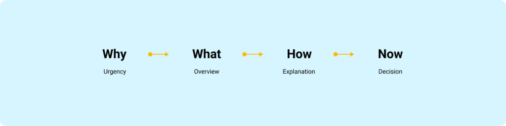
    Use FORMAT as your framing, even when you are not using slides

    FORMAT is a four-frame flow that matches how people pay attention:

    1. Why: Why is this important, and why now?
    2. What: What is the 10,000-foot view? What are the key pieces?
    3. How: How does it work, and how does it affect the user, the business, or the team?
    4. Now (Next): What is the one domino you want the group to push over?

    This is not a “presentation technique.” It is a cognitive shortcut. It answers the built-in objections in order: Why should I listen, what is this about, how does it work, and what do I do with it.

    Simple horizontal framework diagram showing the FORMAT presentation structure: Why, What, How, and Now.
    FORMAT helps stakeholders process information in the order their brains expect.

    The in-house reality: slides are optional, signal is mandatory

    Here is the rule I use: choose the container that reduces friction for the decision you need today.

    When slides are worth it

    Use slides when you need compression and durability:

    • Executive reviews where people will not open Figma
    • Kick-offs where you are aligning on goals, scope, and constraints
    • Large updates where the narrative must travel without you in the room

    When slides slow you down

    Avoid slides for:

    • Weekly design progress
    • Critiques and working sessions
    • Engineer collaboration and handoff conversations

    In these contexts, slides often become theatre. The work lives in Figma. Present it where it lives.


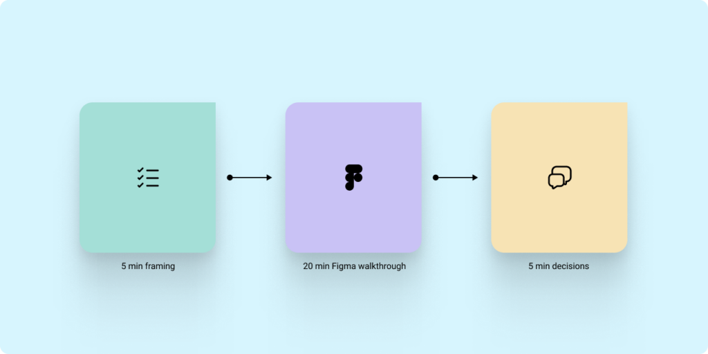
    The hybrid model that works: 5 minutes of framing, then Figma for the work

    If you are presenting progress to stakeholders or leadership, do this:

    1. Open with framing (FORMAT) in a single page or a single frame.
    2. Move into Figma for the walkthrough.
    3. Close with Now/Next and a direct decision or action.

    This keeps the narrative tight without forcing you to build a deck for every touchpoint.

    Workflow diagram showing a hybrid design review process with framing, Figma walkthrough, and decision-making phases.
    Short framing. Live artefact. Clear decision.

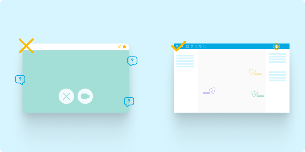
    Stop screen share chaos: invite people into the file and control attention

    Most in-house presentations fail for a boring reason: screen share quality is not reliable. Zooming in and out, jumping across the canvas, and relying on compressed video creates lag and blur. Stakeholders miss details, then compensate with confusion and side questions.

    Instead:

    • Share the Figma or FigJam link before the meeting.
    • Ask stakeholders to open it so they are in the file with you.
    • Use Spotlight (in Figma or FigJam) to keep everyone following your view.
    • Use Comments to capture feedback where it applies.

    This turns your “presentation” into a guided walkthrough where the artefact becomes the record.

    Comparison graphic showing poor screen sharing on one side and collaborative Figma walkthroughs on the other.
    Feedback quality improves when everyone sees the work clearly and comments where the work lives.

    The core structure: Goal, Context, Designs, Ask

    Regardless of container, the content needs a consistent wrapper.

    Context

    What problem are we solving, and what constraints matter?

    Goal

    Are you sharing progress, asking for feedback, or asking for a decision?

    Designs

    Show only what is necessary to evaluate the goal. Label explorations. Make comparisons explicit.

    Ask

    End with the exact input you need. Without an ask, you get noise.


    Guide feedback like a senior designer: set constraints and ask better questions

    Stakeholders will give you better feedback when you reduce the surface area for opinion.

    Set constraints up front

    Tell people what is fixed:

    • Brand colours, typography, core structure

    Then tell them what is open:

    • Information hierarchy
    • Flow clarity
    • Trade-offs between two directions

    Stop asking “What do you think?”

    Replace it with questions that map to outcomes:

    • “Does this make pricing clearer?”
    • “Would this flow make checkout easier?”

    Limit options to avoid decision paralysis

    Too many options produce circular debate. Show two, then ask:

    • “Which direction is closer to our goals, and why?”
    Comparison diagram showing unfocused feedback from asking “What do you think?” versus focused feedback from outcome-based design questions.
    Good feedback starts with good questions.

    What a strong in-house design progress update looks like

    Use this repeatable sequence:

    1. Why: The user problem and why it matters now.
    2. What changed: Before and after, in a few screens or a short flow.
    3. How we decided: The top one or two trade-offs.
    4. Open questions: The 1 to 3 decisions you need help with.
    5. Now/Next: The one action the group needs to take.

    If you can keep the walkthrough to a small set of examples and finish with a clear decision, you are doing your job.

    The point of presenting is progress, not polish

    In-house design is a continuous loop of learning and refinement. The best designers are not the ones with the most beautiful decks. They are the ones who can consistently create alignment, capture high-quality feedback, and move decisions forward, using the tools and artefacts the team already lives in.

    If this topic resonates with you, or if you are working through how to manage up more effectively in your own design role, feel free to connect with me on LinkedIn or reach out through my website contact form.

  • Manage up like you’ve got it together: The workback plan playbook

    Manage up like you’ve got it together: The workback plan playbook

    Illustrated hero banner for a UX design article about workback planning, workload management, and communication strategies for product designers.

    Early in my career, I thought senior designers were simply faster than everyone else. They seemed calm in meetings. They had answers ready. Their managers trusted them with visible work. When priorities shifted, they rarely looked surprised. Over time, I realized something less glamorous. They were not calm because the work was easy. They were calm because they had systems.

    If you are a product designer on a team, you are not only responsible for the design output. You are also responsible for making your work easier to understand, track, support, and protect. You represent the design team every time you join a project, give an update, flag a risk, or ask for a decision. This is where many strong designers struggle. They are talented, thoughtful, and eager to take on more, but they lose track of timelines because they never built one with intent. They say yes too quickly. They surface risk too late. They do the work, but their lead designer or manager has no clear view of whether the work is healthy.

    The outcome becomes predictable. Overwhelmed designers. Late escalation. Rushed decisions. Work that ships without enough space to ask the real question: is this the right solution for the user and the business?

    A workback plan helps solve this

    It gives your work shape before the pressure arrives. It creates space for feedback, decision-making, and trade-offs. It helps your manager see where support is needed before everything becomes urgent. The “got it together” feeling does not come from confidence. It comes from visible signals.

    A clear end goal. A plan that maps to that goal. Early risk flags. Updates people can scan. Trade-offs made before priorities collapse. That is how you show seniority through execution, not job title.

    Principle 1: Work backward from the finish line, not forward from the brief

    When you get briefed on a project, the natural instinct is to start moving. Open Figma. Create frames. Pull references. Sketch the first version. That feels productive, but it can create a problem. You may look busy, but nobody can tell if you are on track. Worse, your manager has no leverage if risk shows up late. At that point, the only option is damage control. Your first deliverable should not always be a wireframe. It should be a workback plan.

    Minimal timeline illustration showing a product design workflow moving backward from launch to scope definition.
    Work backward from visibility, not forward from tasks.

    A workback plan starts from the moment your work needs to land. That might be a leadership review, a product decision, a stakeholder approval, a development handoff, or a launch. From there, you work backwards and define what needs to be true each week to make that moment possible. This is not just personal organization. It is a managing-up move. When you show a product manager, business analyst, or lead designer a workback plan, you are giving them something they can respond to. You are showing what is realistic, where decisions need to happen, and where scope needs to be protected. You should expect pushback. Sometimes a timeline has already been promised before design has assessed the work. That does not mean you compress your plan quietly and inherit the risk.

    It means you bring the trade-offs into the open.

    If the project needs to land sooner, ask what can change. Can scope reduce? Can reviews combine? Can the quality bar shift? Can a later phase absorb some of the work? Can a stakeholder decision happen earlier? The point is not to defend your timeline emotionally. The point is to make the path visible.

    Example: For a six-week project, the plan might look like this

    Week 6: Final moment of truth

    • Present in the key stakehoder meeting (or whatever forum represents “senior visibility”)
    • Confirm the decision you need from that forum

    Week 5: Lock the story

    • Final changes
    • Lock the presentation and narrative
    • Pre-brief your manager on what will be shown and what you are asking for

    Week 4: Version 2 checkpoint

    • Review your second version
    • Schedule a manager check-in focused on: “Are we aligned on direction and risk?”

    Week 3: Stakeholder feedback round

    • Run a feedback round with key stakeholders
    • Capture decisions and trade-offs
    • Identify any cross-team tension early

    Week 2: Version 1 review

    • Review your first version
    • Schedule a manager check-in focused on: “Is this credible and does it meet the end goal?”

    Week 1: Scope and set the lanes

    • Confirm the end goal and what success looks like
    • Finalize scope, assumptions, constraints, and dependencies
    • Identify who must be involved and when

    Why this reads as “they’ve got it together”

    Because you are creating predictability. You are showing that you understand:

    • What matters at the end
    • What needs to be true each week for that end to happen
    • Where your manager needs to show up

    Principle 2: Flag early when in doubt (early equals options)

    Early flagging is not about anxiety or over-communication. It is about creating options while the work is still shapeable. As a product designer, you are not operating alone. You are part of a design team accountable for delivering the right user experience while balancing product goals, business needs, and technical constraints.

    Your manager should not need to attend every meeting with you. That is not scalable. You are an extension of your design lead or manager, which means you participate, lead, represent design clearly, and bring risks back when they matter.

    The simple rule:

    • Early flagging gives your manager options.
    • Late flagging forces damage control.

    Every manager has a different “flag line”. Your job is to learn it, then default to flagging earlier than you think you need to.

    Illustration of ascending workflow steps with a highlighted warning symbol representing early risk escalation in project delivery.
    Early signals create options before the path narrows.

    A deadline might slip. You may have said yes to something you should not have. A stakeholder may be misaligned. A dependency may be shaky. Money may be involved. Your work may be heading into a senior review before your manager knows what is being shown. Those are not small details. Those are signals. When you flag, do not send a vague message like, “I think this might be a problem.” Make it easy to act.

    The simplest early-flag message template

    Subject line: Risk / decision needed

    • What changed: (one line)
    • Impact: (one line)
    • Options: (2 to 3 bullets)
    • Recommendation: (one line)
    • Decision needed by: (date or meeting)

    This shows judgment. You are not handing your manager a mess. You are bringing the situation, the risk, and a recommended path forward.

    Principle 3: Make your updates scannable (because people do not read)

    People do not read as carefully as we wish they did. That is not an insult. It is reality. Your manager may be moving between meetings, Slack or Teams messages, stakeholder asks, roadmap conversations, and people management. If your update is hard to parse, the important part will get missed.

    Scannability is not a writing style. It is a decision tool. Long updates do not fail because they are long. They fail because they do not make it obvious what you need, by when, and what happens if nobody responds.

    Comparison between cluttered communication and simplified structured updates for product design project management.
    Make skimming useful, not dangerous.

    This matters even more in meetings.

    If a meeting invite has no description, the group spends half the time reconstructing context, then leaves without a decision. You can prevent that with a short briefing in the invite or at the top of your notes.

    A strong meeting description answers a few things quickly:

    • Outcome: what should be true when we leave
    • Context: what changed, what is constrained, what has already been decided
    • Preread: links and what to look for
    • Agenda: three items max
    • Decisions needed: one to three bullets
    • Who needs to be there: names and why
    • If you cannot attend: what input is needed asynchronously and by when

    If you only do one thing, write the outcome and the decisions needed. That alone prevents most meetings from becoming a rehash. For Slack or Teams, use consistent labels. You are training people to recognize your pattern.

    A simple update might look like this:

    • Status: At risk
    • This week: Completed stakeholder feedback round and synthesizing themes
    • Risk: Analytics dependency is slipping by one week
    • Ask: Can you help unblock this with the Analytics lead?
    • Next milestone: Version 2 manager check-in on Thursday

    That takes less than ten seconds to understand. That is the goal.

    Principle 4: Have smart reprioritization chats (do not wait to be prioritised)

    Most managers do not want to micromanage your queue. They want confidence that you are spending time on the right things. Prioritization works best as a partnership, but you need to do the thinking first. Do not show up with a vague list of tasks and ask, “What should I do?” Show up with a point of view.

    Minimal illustration of two people discussing timelines, priorities, and workload management in a product design environment.
    Prioritization becomes easier when trade-offs are visible.

    A useful conversation starts like this:

    “Here is how I’m prioritizing. Does this still map to what matters?”

    Then show your current split. What are the top two or three priorities? What is moving more slowly? What is parked? What percentage of your time is going where?

    For example, you might say:

    Task A is taking 20 percent of my time as support work. Task B is taking 70 percent as the primary focus. The remaining 10 percent is overhead, reviews, and team support.

    Then ask the question that makes it collaborative:

    “If Task A is more important right now, what should we reduce or pause to make room?”

    That question changes the conversation. You are no longer absorbing more work silently. You are helping your manager adjust the mix. When you see a delay coming, bring options, not just the problem. Restructure the work first. Look at sequencing, scope, ownership, and dependencies. Bring two or three credible options, explain what each one protects, and recommend a path.

    Then ask for validation. That is the difference between waiting to be managed and managing up.

    Organization does not fix every broken system

    There is an important caveat here. Good planning does not fix unrealistic leadership. It does not fix a chaotic culture. It does not make under-resourced teams magically healthy. Some environments will still create impossible conditions.

    But strong organization helps you separate a planning problem from a business problem. If something fails, you want clarity on why. Was the scope too large? Was the deadline unrealistic? Was a dependency missed? Was feedback late? Was there no decision-maker? When your work is structured, the answer is easier to find. That protects you, your manager, and the quality of the work.

    Make it boring in the best way

    One thing I learned over the years is that seniority is rarely announced. People feel it through consistency. Through clarity. Through how predictable you become under pressure. The designers who build trust fastest are usually not the loudest people in the room. They are the people who reduce uncertainty for everyone around them.

    A workback plan is not glamorous. Early flagging is not dramatic. Scannable updates will not make anyone clap in a meeting. But they work. They help your manager support you. They help your team trust you. They help stakeholders understand what is happening and what decisions they need to make.

    And, most importantly, they create enough space for better design decisions. If you are a product designer trying to grow into more ownership, start here. Build the plan. Flag early. Make your updates useful. Bring options when priorities shift. That is how you look organized. That is how you protect the work. And that is how you start leading before the title catches up.

    If this topic resonates with you, or if you are working through how to manage up more effectively in your own design role, feel free to connect with me on LinkedIn or reach out through my website contact form.

  • Building a design system while the product ships

    Building a design system while the product ships

    I’ve been in this situation more than once. You join a company, or step into a new scope, and realise the design system either doesn’t exist or exists in fragments. Some components are duplicated. Some are outdated. Some were built once and never touched again. Designers are doing their best to stay consistent, but everyone is solving problems slightly differently within their own libraries.

    At the same time, the business is moving. Designers are shipping work. Engineers are building features. Product is pushing forward. And you’re hired to fix it. Not in six months. Not when everything slows down. Now. That’s where the reality sets in. You don’t get to stop the world to build a design system. You have to build it while everything is already in motion.

    The moment things shift

    At first, it feels overwhelming. You look at everything that needs to be done. Foundations, components, documentation, accessibility, alignment with engineering. It’s easy to fall into the trap of thinking you need to define everything upfront.

    But that’s not how this works. The shift happens when you stop treating the design system as a standalone project and start treating it as infrastructure that evolves alongside the product. You’re not building something in isolation. You’re stabilising a system that is already in use.

    Listening becomes your roadmap

    The most valuable signal doesn’t come from audits or frameworks. It comes from your team. You start paying attention to what designers or teams say during critiques, project reviews, and casual conversations.

    • Someone asks which button to use.
    • Someone recreates a component because they couldn’t find it.
    • Someone builds a new pattern because nothing existing fits their need.

    Those moments matter. Instead of treating them as one-off questions, you treat them as patterns. You listen closely, not just to the question itself, but to what it reveals about the gaps in your system. Over time, those signals start to form a clear direction. Not based on assumptions, but based on real usage.

    Diagram: Designer signals → backlog (Asana) → system updates → reuse

    Balancing reactive and proactive work

    It’s easy to become reactive in this phase. Designers need help. Projects are moving. Questions keep coming in. If you only respond to what’s in front of you, the system becomes fragmented. You solve problems one by one, but you never step back to connect them.

    This is where structure comes in. For me, that structure lives in a task board. I personally use Asana to track every component, pattern, or guideline that needs to exist. I’ve even set up a web form for peers to submit component request. Every question, every gap, every repeated workaround gets captured. That gives you visibility.

    You’re no longer guessing what to build next. You’re prioritising based on:

    • What’s blocking designers
    • What’s being recreated
    • What’s inconsistent across the product

    At the same time, you look ahead. If you notice three teams building slightly different versions of a form, you don’t wait for a fourth. You step in and define the pattern before it spreads further. That’s the balance. You respond to real needs, but you also prevent future problems.

    You don’t build it alone

    Even if you’re responsible for the system, you don’t build it by yourself. You design it with the team. That might be a group of in-house designers. It might include external agency partners. It might be a mix of both. It doesn’t matter.

    What matters is that the system reflects how people actually work. When a designer creates something new, you don’t immediately absorb it into the system. You ask questions.

    • Why did you need this?
    • What problem were you solving?
    • Does this apply beyond this one page?
    • How would this scale if we used it in five other places?

    Those conversations shape the system. You’re not collecting components. You’re extracting intent and turning it into something reusable.

    Structuring the system in Figma

    As the system starts to take shape, structure becomes critical. The way I approach this is by separating the system into three core libraries.

    The first is the brand foundation. This includes typography, colour tokens, spacing, iconography, and visual primitives. These are the elements that define the brand across every platform. They don’t change often, and when they do, it’s intentional.

    The second is the component library for web and shared experiences. This is where buttons, forms, inputs, navigation patterns, and reusable UI elements live. This is the layer most designers interact with daily.

    The third is the platform-specific library, usually for iOS and Android. These components respect native behaviours and constraints. They can’t always match the web, and that’s fine. They serve a different purpose.

    Keeping these separate reduces confusion. Designers know where to go. Engineers know what maps to what. The system becomes easier to navigate and maintain.

    Brand foundations, shared components, and platform libraries structure

    Building with engineering changes everything

    The moment you bring engineering into the process early, everything improves. When engineers are involved while components are being defined, they start to understand the intent behind the work. They ask better questions. They flag edge cases earlier. They help shape behaviour, not just implementation.

    But this only works if they know how to collaborate inside the design environment.

    When I first stepped into this, I realised something quickly. The problem wasn’t just the absence of a system. It was that engineers hadn’t been properly onboarded into how to use Figma as part of their workflow. Figma Dev Mode existed, but it wasn’t being used effectively. Handoffs were still happening in fragmented ways. Measurements were being interpreted differently. Tokens weren’t always clear. Designers and engineers were technically using the same tool, but not speaking the same language.

    So I treated onboarding engineers as part of building the system.

    I created and led training sessions focused on:

    • How to use Figma Dev Mode properly
    • How to inspect components, states, and variants
    • How to understand spacing, tokens, and behaviour directly from the source
    • How to collaborate with designers inside the file instead of outside of it

    More importantly, I didn’t treat it as a one-time session. I worked alongside them. I answered questions in real time. I adjusted documentation based on where confusion showed up. Over time, something shifted. Engineers stopped seeing Figma as a static handoff tool. They started using it as a source of truth. They became more confident navigating components. They relied less on assumptions and more on what was defined.

    And as the component library grew, the system became easier to implement correctly, because the foundation was shared. When you build the system with engineering, and you invest in how they engage with it, the quality of what gets shipped improves significantly. You move away from interpretation. You move toward alignment.

    Diagram: Design → Figma Dev Mode → Engineering → Code → Feedback loop

    Defining how things get added

    As the system grows, contribution needs to be intentional. Not every new design should automatically become a component. Not every variation deserves a place in the library.

    This is where your role becomes more focused.

    You define:

    • What qualifies as a reusable component
    • How it should behave across different contexts
    • What states and edge cases need to be included
    • How it should be documented

    You also make it clear how designers can contribute. They don’t need to wait for you to create everything. But they do need to align with the system. This keeps the system from becoming noisy.

    Letting the work guide the system

    Over time, you realise something important. The product is not slowing down. And that’s fine. The ongoing work is what shapes the system. Every feature, every flow, every constraint adds another layer of understanding. Your role is to capture that learning, structure it, and make it reusable.

    You’re not chasing perfection. You’re building consistency over time. And at some point, it stops feeling like you’re building a design system.

    You’re building alignment between designers and engineers.

    You’re building clarity in how decisions are made.

    You’re building speed because people don’t have to start from scratch.

    You’re building trust in the product because it behaves consistently.

    The components are just one part of that.

    There’s no clean starting point for this kind of work. It’s always a bit messy in the beginning. But if you stay close to the team, listen carefully, and build with intention, the system starts to take shape. Not as a separate artifact, but as something that lives inside the way your team works. If you’re currently navigating this or thinking about how to structure your own system, feel free to reach out. I’m always open to exchanging ideas.

    You can connect with me on LinkedIn⁠ or through the contact form⁠ on my site

  • When you want in but haven’t been in yet: Framing transferable skills when pivoting as a designer

    When you want in but haven’t been in yet: Framing transferable skills when pivoting as a designer

    View from inside a coach bus with passengers seated, facing forward toward a bright road ahead

    I recently came across a job posting that caught my eye. The product sounded exciting, the team structure looked solid, and the space (fintech) was one I’ve recently wanted to explore more deeply. But as I read the role description, I had a moment of pause. Some of what they were looking for was familiar, but some parts felt still green within me. No direct fintech work in my portfolio. No recent native mobile-first product case studies. They were also deep into integrating generative AI into their app. I hadn’t directly built anything like that either.

    So what now? Close the tab and move on?

    This is where a lot of designers hesitate. If your current or past roles don’t give you case studies in the exact domain you want to move into, what are you supposed to do? Go back to school? Hope your manager assigns you something relevant? Wait until you’re “ready”?

    You’ll wait a long time.

    The reality is, you can reposition your experience now. You just need to know how to frame it. This article breaks down how I approached that situation, how I moved forward in the process, and what I did to credibly bridge the gap between my experience and their expectations.


    First: They’re hiring a thinker, not just a skill set

    The role was focused on building a consumer-facing financial product. Think credit, transfers, budgeting, savings nudges, and fraud detection. A lot of it tied closely to mobile UX under regulatory constraints. Most of my past work had been in B2B, data platforms, and internal tools. But the foundation wasn’t irrelevant. I’ve worked on complex flows, high-stakes systems, and products where one mistake breaks user trust. That doesn’t show up unless you write it that way. So before applying, I adjusted how I framed my work. No bull-shit, just clearer signals.

    How I positioned myself in the interview

    Here are some themes I knew mattered to them, and how I made sure I could speak to them with credibility.

    AI-driven personalisation and automation

    Their product was actively exploring ways to use AI across design and development, including smart insights and automation.

    In the interview:

    • I shared where I’d already used AI tools (ChatGPT, Magician in Figma, Midjourney for visual thinking).
    • I suggested ways their app could surface AI-generated nudges to help users make better spending decisions.
    • I talked about working with data teams at Booking and how that gave me experience grounding design in real behavioural signals.

    I didn’t pretend I’d built an AI product. I showed I’d thought about how I would.

    Mobile-first UX in a regulated environment

    Their app was the product. Every screen needed to meet accessibility and compliance requirements while staying responsive and usable.

    In the interview:

    • I explained how I led and established the foundation of accessibility work at Booking, including screen reader support and WCAG audits.
    • I talked about redesigning checkout flows for Roots’ eCommerce platform years ago, simplifying dense interactions for mobile while preserving transparency and control.
    • I considered offering a teardown of one of their onboarding or payment flows to show how I’d approach structure and clarity. But I’ve become cautious about giving direct feedback on an interviewer’s live product, I wrote more about why in a past article.

    The lesson: You don’t have to have done the exact thing. But you do need to show how you’d think through it.

    Designing with clarity and precision

    I positioned myself as someone who:

    • Knows why design is high-stakes, especially in transactional systems
    • Reduces complexity without dumbing down
    • Leverages AI and prototyping to test faster
    • Cares about legal, ethical and accessible design
    • Has worked on large design systems and can scale thinking across touchpoints
    • That message came from reshaping how I spoke about my work, not changing the work itself.

    How I reshaped my resume and portfolio

    I didn’t start over. I reframed what I had and filled small gaps that mattered.

    Mobile-first, consumer-facing design

    My resume focused heavily on B2B. But I’d done consumer UX earlier in my career, Roots, Home-Depot, Aldo, even side projects, but I hadn’t surfaced that clearly.

    What I did

    • Added a “Selected projects” section to re-surface those early B2C highlights.
    • Included 1–2 lines under my Roots experience that mentioned mobile-first design and responsive patterns.
    • Mentioned a few personal usability tests I’d run on mobile patterns, even if they weren’t tied to a company.

    That was enough to shift the perception.

    Fintech and personal finance relevance

    I hadn’t worked in financial services. But I had designed for high-security, transaction-sensitive environments.

    What I did

    • Added a bullet point under my Booking work around building UX for secure and auditable data actions.
    • Made a note in my portfolio that if selected for interview, I’d be happy to sketch a case study for a fictional mobile budgeting app.

    Showing initiative is the shortcut.

    Using AI in design workflows

    They were upfront about wanting candidates who had a mindset for exploring AI.

    What I did

    • Created a new bullet under my current role that mentioned where I’d used generative AI to support ideation and prototyping.
    • Showcased a few upskilling resources:
    • Practised writing clear AI prompts for research synthesis and UI copy support.

    It’s not about being fluent. It’s about showing fluency is something you’re working on.


    The angle that works

    While prepping for this interview, I coincidentally connected with a local senior product manager on LinkedIn and came across a recent post they had shared. In their spare time, they had challenged themselves to build a lightweight app using GenAI prompts through V0.dev and Google’s API. The output wasn’t polished, but that wasn’t the point. What stood out was the curiosity, the effort and the intent. They were exploring accessibility issues in walking directions, and learning how product and GenAI workflows might come together in a practical way. That kind of project is worth just as much as formal work experience. Probably more. It shows interest, not just obligation. This is the main point. If you’re breaking into a new space, your portfolio doesn’t need to come from a job. It just needs to show how you think. That you’re already heading where they’re going.


    Final thoughts

    If you’re trying to move into something new (fintech, healthcare, AI, climate tech), you probably already have the skills. The hard part is figuring out how to position what you’ve done in a way that feels relevant. That comes down to reframing, not starting from scratch.

    This reminds me of something Jim Collins wrote in Good to Great. He studied companies that made the leap from being good to industry-defining, and one of the things he found was that greatness didn’t come from hiring people with the perfect résumé or deep domain expertise. It came from hiring the right people first, people with the drive, the thinking, the character, and then figuring out where to take the company.

    “They first got the right people on the bus… and then figured out where to drive it.”

    That principle still holds. You don’t need to have worked in fintech or mobile AI to be the right designer. But you do need to show you’re already thinking like someone who does. If you’re pivoting right now and want to run your angle by someone, I’m always open to connecting. Reach out on LinkedIn or use the contact form on my site.

  • Collaborating with engineers: Treating your teammates like users

    Collaborating with engineers: Treating your teammates like users

    Designers and engineers working in front of computer screens in a modern office

    One topic that comes up often when I sit down with designers, whether junior or senior, is collaborating with engineers. It doesn’t matter if I’m talking with designers from Montreal, Toronto, Amsterdam or Seattle based. Designers always have strong opinions about this relationship.

    Usually, everyone gets along fine on the surface. But when you start a project together, things can get tense. Designers complain engineers aren’t following their guidance or are building things without checking with them when steps are missing. Engineers complain designers hand over features that aren’t feasible or clear. Or even consult them on these ideas. Honestly I’ve been there myself, I have heard it all since the start of my career.

    Over time, I learned a simple mindset shift that changed everything: treat your engineers as a core user of your design process. They are trying to use your work to build a product. If they’re frustrated, that’s a sign of friction you can fix.

    Here’s how I approach collaborating with engineers. This process has saved me time, prevented late-stage surprises and built stronger trust with my teams.


    Minimal graphic of two people talking with speech bubbles above them on a light blue background

    1. Start with an open conversation

    When I join a new team, I schedule time with each role to walk through:

    • How I work: I over-communicate rather than leave assumptions. I show what tools I use to share progress and what they can expect by the time we get to handover. I walk them through my Figma template structure. (Small brag, but there is always a “wow” factor from them)
    • How they work: I ask how they prefer to receive designs, which channels they like for questions, what they enjoy the most during projects and what has annoyed them in past projects.
    • What success looks like: We talk about what makes their job easier and what has caused problems before. How they prefer to collaborate in general.

    I listen carefully, I leave my ego as a designer outside of the conversation, take notes and show empathy for any past frustrations. We then agree on ways to avoid those issues together.


    Graphic showing a person speaking into a microphone, symbolising clear communication

    2. Keep everyone informed throughout

    Throughout the project, I make sure all roles know what’s happening, trandparency and communication is crucial:

    I know, engineers are always the one that are most often the quiet ones or complaining they have better things to do, but…

    • Regular check-ins: Meetings are the best way to align, even if there’s not much to share from their end and just show up to stay aware.
    • Written updates: If someone can’t attend, I send a summary email with decisions, progress and blockers to everyone.

    This prevents surprises. If engineers know what’s coming, they can still raise concerns early.


    Checkmark, cross, and person icon representing project evaluation and feedback

    3. Do a post-launch retrospective

    After launch, I set up a one-on-one with the engineer(s) to review:

    • Did the handover meet expectations?
    • What worked well?
    • What could improve next time?

    Most teams do retros as a group, but a private conversation helps you get more candid feedback if the engineer isn’t much of a public speaker. This is how I’ve kept refining my process over the years and my Figma template.


    4. Use a structured Figma template

    One tool that consistently helps is my Figma file template. Here’s what I include:

    PagePurpose
    Cover pageClear title, team members, date. Helps anyone opening the file know what it is.
    Project overviewWhat, Why, Who: goals, stakeholders, hypotheses, UX outcomes, scope, risks. Links to related docs.
    Current state auditScreenshots of existing features, success and error states. Comments on what works and what doesn’t.
    Meeting notesA space to store important files and notes so nothing gets lost in Drive.
    Design explorationI make sure everyone understand that they cannot leave any reviews on this page, they should in general not be looking at this page. This is where I has a designer should be allowed to explore all the ideas and potential solutions.
    Team discussion review + feedbackThis page is to allow you to place a few mocks, or userflows to have it reviewed by the team during a design critiques. They in general should be asking questions or leaving a lot of stickie notes with their feedback.
    Spec sheetsOne page per feature. Each includes user flows, default and error states, annotations, and rationale. Engineers can link these directly to Jira tickets.

    Why this works

    Breaking down each feature onto its own page avoids confusion. Engineers most often work with Jira to keep track of their accomplishments and progress of the project, so they prefer to include a single link for each Jira ticket being created instead of digging through a massive Figma file with everything. Making sure clear annotations answer most of their questions before they have to ask. Your spec-sheet need to walk them through the user journey, not just have pretty images.

    Those specsheets need to offer, the default view, the success or error phases, if your project is available in a different language, include a sample of it also, just to make sure the engineer understands if something shifts and how the design will adapt. Keep your desktop and mobile views together if that is how your engineer prefers to work.

    Since adopting this approach, I rarely get last-minute pushback or repeated clarifications. The transparency and structure make delivery smoother and it also helps leadership and product managers aware of the deliverable.


    Final thoughts

    Collaborating with engineers doesn’t have to feel like a battle. If you treat them as a key user of your process, you’ll see fewer frustrations and better outcomes.

    If you’d like a discuss further of my Figma template or want to share your own methods, I’m always interested in learning what works for other teams.

  • Designing joy: A design manager’s role in making work fun again

    Designing joy: A design manager’s role in making work fun again

    Office cafeteria with a Pictionary board showing a sketched character, surrounded by LEGO pieces, paper balls, shapes, and an hourglass

    Over a quiet 1:1 with my own manager one morning, we got into a surprisingly energising conversation about what really makes a team thrive. Not survive, but actually thrive. While we can’t control market downturns, restructuring, or sudden strategy pivots, we can influence something just as powerful: how our team feels during the hours they give us each day.

    This article is for design managers who want to create not just a productive, but also joyful and mentally healthy culture for both the team and the individuals within it. Here are the mindset shifts and rituals I’ve found most effective and a few practical examples you can adapt.


    The energy gap between deadlines

    We all know how easy it is for weeks to blur into a mix of Zoom calls and Figma comments. Team-building events once a quarter sound nice on paper, but what about the other 89 days? If your team only laughs together once a quarter, it’s no wonder many end their week burnt out.

    I started experimenting with smaller, recurring activities: 30-minute pictionary matches (we are designers after all), casual walks talking about an exciting show or movie, or LEGO building breaks with a theme in mind. Nothing too grand, but enough to break the “always-on” rhythm and let people connect as humans. These regular touchpoints give space to recover from the mental tax of problem-solving. They also help colleagues see one another in a different light, which boosts collaboration.


    From goal-setting to goal-guiding

    When it came time for performance conversations, I realised many team members struggled with setting exciting or joyful personal development goals. Not because they lacked ambition, but because they hadn’t been taught how to articulate what really drives them.

    That’s when I came across the concept of a cardinal direction. The term itself has roots in philosophy, from the Latin cardo, meaning “hinge.” Cardinal virtues, as described by thinkers like Plato and Aquinas, were considered foundational qualities that all other virtues turned upon. That metaphor stuck with me. In the context of design careers, a cardinal direction isn’t a fixed end goal, but a guiding orientation, grounded in your values, the environments you thrive in, and the impact you hope to create. Unlike rigid goals, your cardinal direction evolves with you, helping you prioritise projects and shape opportunities with more purpose.

    As a manager, I stopped treating career goals as a solo homework assignment and instead turned them into a collaborative reflection. I began asking questions like:

    • What kind of work energises you?
    • What do you want to be known for in the next 2 years?
    • What does a great day at work feel like for you?

    The purpose isn’t to lock people into one rigid path but to encourage them to keep tuning into what gives their work meaning.


    The human side of leadership

    We spend a lot of time trying to be good mentors, coaches, and delivery leads, but how often do we think about being a good vibe setter?

    A design manager’s impact goes beyond career ladders and sprint boards. We shape emotional culture, the unspoken tone that defines whether your team ends the day feeling drained or fulfilled. That doesn’t mean putting on forced positivity or making fun mandatory. It means showing up with curiosity, creating psychological safety, and making space to celebrate small wins, not just OKRs.

    And it also means being available. When a teammate asks for guidance on their goals or signals they’re feeling overwhelmed, be ready to listen and suggest without defaulting to “You’ve got this — I trust your instincts”. Leadership isn’t about having all the answers, but being the kind of person others trust to help them ask the right questions.


    What if fun was part of the job?

    Big companies like Pixar have long recognised that creative risk-taking requires play. It’s not just a perk, it’s infrastructure. Weekly art sessions, silly internal competitions, even the occasional mean caricature night. Because they know that looseness in the day helps spark something later at the desk.

    You don’t need to copy-paste what others do. But you do need to ask: what feels meaningful and energising for this team, right now? It could be storytelling lunches. It could be collective journaling. It could be skipping all of it and just leaving early once in a while.

    What matters most is intention. That you design not only your product, but also your team’s experience of work. Because ultimately, the strongest products come from the healthiest, most connected teams.


    Final reflection:

    One thing I always tell my team, and remind myself of often is this: if something inside you is uneasy, pay attention. The way a manager responds to your questions or dismisses your need for clarity says a lot. If you’re a manager, take note: silence or impatience can become culture by default. Be the person who shows up. Fun isn’t a side dish to good work. It’s a sign of a well-fed team.

    Would love to hear how you’ve made work feel more human and fun. Reach out anytime on LinkedIn or drop me a note through the contact form. Let’s design better, together.

  • When design tests cross the line: Recognising red flags in UX hiring

    When design tests cross the line: Recognising red flags in UX hiring

    A desktop monitor and payment machine sit in front of a misty Newfoundland backdrop, with a digital interface glowing on the screen and birds flying overhead.

    It started over chai.

    I was sitting with my mentor at a cafe, catching up. We got onto a topic that’s been bubbling under the surface for me, the often murky space of design interviews, and more specifically, design tests.

    Now, I understand that small companies or start-ups might not have fully formalised hiring processes. That’s okay. Not every team has a dedicated recruiter or the luxury of time. But we’re well past the point where best practices are hard to find. There are books, online guides, and industry examples everywhere. Ignorance is no longer an excuse.

    So let’s talk about one specific red flag: the design test that crosses the line into free labour.


    The project that felt wrong

    I had recently been interviewing with a promising early-stage company. The product was interesting, the team sounded kind, and the challenge felt like a good fit. I even had a great connection with one of the designers during the process. Things were going well.

    Then came the design test.

    What should have been a whiteboarding exercise, a one-hour prompt to assess thinking, not output, turned out to be a fully scoped product challenge. It required end-to-end mock-ups, with strategic reasoning and near-production-level design quality. And the brief? It was tied directly to the company’s current product strategy.

    Alarm bells.

    I politely questioned the scope. Their reply: “You decide how long you want to spend. Some people take two hours, others eight.”

    Eight hours. Unpaid. On a real business problem.

    This wasn’t an open-ended exploration or a design jam. This was spec work disguised as an interview.


    Where this crosses a line

    Whiteboarding exercises have long been a part of design hiring. At their best, they test how we think, how we prioritise, how we communicate. But when the scope balloons, and the topic starts to look like the company’s backlog, it’s no longer hypothetical.

    The distinction matters. Good prompts are intentionally abstract, think ATM machines, fictional dashboards, or generic onboarding flows. These setups level the playing field. They remove the possibility of candidate work being reused or mined for ideas.

    If the design test mirrors a live problem the company is tackling, and candidates are pouring hours into it, that’s not a test. That’s unpaid labour.


    You’re allowed to say no

    When I explained why I wouldn’t proceed with the test, I kept things respectful. The conversation stayed polite. But I knew I had to withdraw.

    That was a values moment. And as uncomfortable as it felt, I was proud to hold the line.

    My mentor told me another story. A designer she knows responded to a similar test with a simple request: “Happy to complete this, here’s my freelance rate and availability.” Bold. But fair.

    She didn’t get the job. But she didn’t get exploited either.


    What should we do instead?

    Interview red flags aren’t always glaring. Sometimes they hide in plain sight:

    • The over-scoped assignment
    • Vague expectations
    • Lack of feedback after significant effort
    • Defensive replies when you ask questions

    As a community, we need to normalise better practices. If you’re hiring:

    • Keep challenges short, hypothetical, and focused on process
    • Compensate candidates if the task requires substantial effort
    • Be transparent about what you’re evaluating

    If you’re interviewing:

    • Ask questions. Clarify timelines and expectations
    • Don’t ignore your gut
    • Share your boundaries calmly and professionally

    Closing thoughts: Respect starts at the first conversation

    The interview process should be a space of mutual respect, not silent compliance. As designers, we are trained to ask the right questions, and that shouldn’t stop at the design brief. Ask questions during the hiring process. Clarify expectations. Express your boundaries. The way a company responds tells you a lot about how they value your time, your skills, and your voice.

    If a recruiter or hiring manager cannot make time to explain their process, or reacts defensively to reasonable questions, that’s a red flag. Not every sign of disorganisation is ill-intentioned, but a repeated lack of clarity or fairness often points to deeper issues in how the organisation operates.

    Stay professional. Stay calm. But most of all, stay honest with yourself. If your gut tells you something is off, even if everything looks great on paper, trust that instinct. Upholding your own values during interviews is not just about finding a job. It’s about protecting your mental wellbeing and shaping a better design industry for everyone.

    If you’ve experienced similar situations, or want to chat about interview red flags, connect with me on LinkedIn or send a message through my contact form.

  • The business case for UI design: Measuring impact in the GenAI era

    The business case for UI design: Measuring impact in the GenAI era

    A person walking on a white path through blue rice fields, with subtle GenAI icons visible in the landscape

    It’s time to stop treating UI design as a cost centre and start measuring it as a strategic advantage. When designers ask, “What value does my UI work bring to the business?”, the answer should be clear, structured, and backed by measurable outcomes.

    This article is written for designers navigating performance reviews, team impact, or personal growth. If you’re wondering what separates a designer who makes things look good from one who drives meaningful results. Read on.


    UI design has always delivered business impact. We just haven’t been great at measuring it

    UI design often gets lost in the shadows of broader UX or product conversations. Yet it plays a vital role in shaping the last mile of customer experience, where intention becomes action.

    Even the most well-place call to action can go unnoticed if the visual hierchy is unclear, or if micro-interactions fail to guide users effectively. This is where UI decisions become critical to enabling business outcomes.

    But to advocate for UI’s contribution, we need metrics that reflect its role in the success of the experience.

    Funnel diagram showing the relationship between UX strategy, information architecture, UI, interaction, and conversion

    Traditional metrics: What we can already track

    Design teams already have access to a solid foundation of UI-related performance metrics. These form the backbone of most analytics dashboards and help establish baselines for tracking product health.

    Diagram: traditional UI metrics

    • Task success rate
    • Conversion rate
    • Drop-off rate per screen
    • Time to completion
    • Accessibility score (e.g. WCAG compliance)
    • Interaction error rate
    • Satisfaction score (via post-task survey or HEART)
    • Visual hierarchy scan path (via eye tracking or click data)

    But once all this data is collected, the real challenge begins: What does it all mean in context? When some signals are strong and others are weak, designers need to move beyond reporting and into storytelling. This is where clarity of intent becomes vital.

    Example:

    A redesigned checkout screen increased task success rate from 72% to 91%, with a 23% drop in cart abandonment. The UI change? Simplifying form fields and repositioning error messages.

    These numbers don’t just reflect good aesthetics, they reflect business growth, loyalty, and cost reduction.


    Align metrics to design intent

    Not every metric matters equally for every project. The first step is to clearly articulate the goal of the UI change, so that the right metrics are prioritised.

    Start by identifying the primary outcome the design aimed to influence. Then classify available metrics as:

    • Leading indicators – directly tied to the design goal (e.g. reduced drop-off on a pricing page).
    • Supporting signals – helpful but not decisive (e.g. eye tracking showing improved scan path).
    • Lagging indicators – longer-term effects (e.g. higher NPS or retention).

    When metrics are in conflict (e.g. drop-off improves but satisfaction dips), tie your interpretation back to the strategic intent. Explain which trade-offs are acceptable in the short term, and which require further investigation.

    Example: If your new UI reduced friction and boosted conversion, but satisfaction dropped slightly, that could still be a strategic win. If your business goal was short-term acquisition. But if you’re designing for long-term trust or repeat use, that dip deserves attention.

    Where possible, correlate movement across metrics. A stronger case emerges when time-to-completion, conversion, and scan path improve together. If metrics diverge, consider A/B testing or heatmap analysis to understand the root cause before drawing conclusions.

    The key is to go beyond reporting numbers. Use them to build a credible, outcome-focused narrative about how UI design contributed to business performance, ****even when the signals are nuanced.

    Example:

    • Hypothesis: By clarifying visual hierarchy on the search results page, users will make faster decisions and reduce bounce rate.
    • Metric: Time to first meaningful click, compared before and after redesign.
    • Outcome: A 17% reduction in decision time and higher satisfaction score.

    Enter GenAI: The new layer in UI impact

    With the arrival of generative AI, personalisation, and adaptive interfaces, UI design now includes algorithmically generated content, layouts, and interactions. This makes measurement more complex, and more important.

    Diagram: traditional versus GENAI UI metrics

    Traditional MetricsGenAI-Era Metrics
    Task success rateAI content alignment rate
    Measures how well AI-generated suggestions match user intent or context.
    Conversion rateIntent-to-conversion accuracy
    Tracks how accurately dynamic content nudges users toward meaningful outcomes.
    Drop-off rate per screenDrop-off rate after AI interaction
    Looks specifically at where users abandon flow after engaging with AI suggestions.
    Time to completionAI time saved per user task
    Quantifies the efficiency gained through AI-generated shortcuts, summaries, or content.
    Accessibility scoreAI accessibility override incidents
    Tracks how often AI-generated outputs break or bypass accessibility standards.
    Interaction error rateCorrection rate of AI-generated content
    Measures how often users need to correct or discard AI responses, indicating quality and trust.
    Satisfaction score (e.g. HEART)User trust in AI suggestions
    Captures the subjective comfort, confidence, or reliance on AI-generated content.
    Scan path (e.g. eye tracking)AI interaction entry point
    Identifies where and how users first engage with AI in the interface and whether it enhances or distracts.

    Measuring the invisible hand of AI

    When AI is embedded into your UI — offering smart suggestions, predicting content needs, adapting layouts — its influence can be subtle but powerful. You can’t always measure it with surface-level metrics like clicks or screen flow alone. So how do we trace its impact?

    Start by understanding what would have happened without AI. This baseline helps you frame the right questions.

    Example:

    Let’s return to a hotel search scenario. Traditionally, users are given fixed filters (location, price, amenities) and they manually fine-tune options. As UI designers, we’d track:

    • Time to filter application – How long until the user starts adjusting filters?
    • Drop-off after applying filters – Did filtering overwhelm them or narrow results too far?
    • Completion rate – Did they continue to book?

    With GenAI, the flow changes. The system learns what the user values based on their past preferences or real-time behaviour, and dynamically adjusts results or surfaces smart filters before the user asks.

    Now, the metric might evolve into:

    • Time to confident selection – How quickly do users find something they feel good about choosing?
    • Trust in AI-assisted filters – Did the suggested filters reduce effort or confusion?
    • Booking likelihood with dynamic filters – Did more users convert when filters adjusted to them?

    A UI designer working on a travel platform experimented with GenAI-generated layout variants, different arrangements of filters and content blocks tailored to user segments. The tracked metric? “Time to satisfied decision.” It dropped from 6.5 minutes to 3.2 minutes across key user segments, with no drop in NPS (Net Promoter Score, a measure of user satisfaction and likelihood to recommend).

    By comparing these, designers can demonstrate the added value of adaptive interfaces over rule-based ones. GenAI isn’t just a backend boost, it’s a UI shift that reshapes how users perceive, interact with, and trust the product.


    What this means for designers

    You’re not just crafting interfaces, you’re crafting results. Understanding what to measure, and how to prove your value, is key to evolving your role.

    A great UI designer today:

    • Designs with measurable hypotheses
    • Partners with data and engineering to set trackable goals
    • Optimises not just flows, but outcomes
    • Understands AI’s role in personalisation and performance
    • Knows how to interpret user interaction data
    • Can explain how design changes moved a business metric

    If your team isn’t tracking how your design work contributed to company outcomes, consider starting that conversation.


    Closing thoughts: Metrics as a language of value

    We measure what we value. It’s time to ensure the UI design craft is included in the metrics conversation, not as decoration, but as a driver.

    The future of UI design is not just about aesthetics or usability. It’s about business impact at scale, informed by data and shaped by AI.

  • What is left of UX design when AI takes the rest?

    What is left of UX design when AI takes the rest?

    A group of UX designers discussing ideas around a high table in a modern office

    A few weeks ago, I found myself staring at a blank doc, reflecting on a simple but confronting question: What parts of my job can be done by AI now? And more importantly, what’s left after that?

    Like many UX designers, I’ve felt the shift. AI is no longer just a speculative trend. It’s present in the tools we use, the processes we follow, and increasingly, in the skills we once considered safe. Prototyping tools suggest components. Copy assistants draft onboarding flows. Research summaries generate themselves.

    And it’s only just getting started.

    So I did what many of us would. I sat down, took a breath, and listed every task I do as a senior UX designer. The strategic, the collaborative, the repetitive. Then I ran a mental yellow line through each one AI could already do, or soon will.


    Chart displaying UX design tasks with AI-automated ones crossed out

    What AI is already doing (And doing well)

    If you’ve used tools like Figma’s AI plugin, Uizard, or Notion’s AI writing assistant, you’ll know how fast certain parts of design work are being reshaped.

    For example:

    • Wireframes from text prompts? Already possible.
    • Heuristic checks for accessibility? Automated in tools like Stark.
    • Flow suggestions based on user testing? Now available in Maze.
    • AI suggesting which component to use? It’s happening inside design systems.

    These aren’t “assisted” workflows anymore. They’re replacements for specific tasks. We don’t need to debate whether these are good or bad. We just need to prepare.


    What’s left?

    After crossing out everything AI can reasonably perform, I looked at the remaining tasks. What I saw wasn’t a shrinking role, it was a shift. A shift toward the kind of work that’s messy, strategic, emotional, and deeply human.

    Here’s what stayed on the list:

    • Identifying the right problems to solve
    • Facilitating alignment across diverse teams
    • Translating scattered user feedback into design direction
    • Visioning future states beyond the constraints of a prompt
    • Designing ethically in sensitive or ambiguous contexts
    • Framing ideas through storytelling
    • Mentoring and raising the design bar for others
    • Spotting nuance in patterns AI might miss
    • Evolving systems for scalability and clarity

    These are not tasks you can template or generate. They require emotional intelligence, contextual judgement, political sensitivity, and a collaborative mindset.


    Three concentric circles illustrating tasks AI can do, assist with, or only humans can lead

    What does this mean for the role?

    The UX designer role isn’t disappearing. But it’s splitting.

    Some responsibilities will shift toward system orchestrators who work with AI as a collaborator. Others will lean into deep human expertise, particularly around ethics, strategy, and storytelling.

    What emerges is a new kind of design professional. One who curates instead of produces. One who coaches instead of executes. One who facilitates alignment, not just delivers assets.

    If we’re willing to let go of rigid role definitions, we may find ourselves becoming:

    • UX Intelligence Partners who translate AI-generated patterns into product decisions
    • AI Interaction Designers shaping the tone and behaviour of AI across platforms
    • Human-AI Collaboration Leads defining the workflows where people and machines meet
    • System Architects who govern how feedback, metrics, and models shape experience design at scale

    Note: The titles above are not job postings you’ll find on job boards. Instead, think of them as focus areas or emerging skill sets. They reflect how responsibilities may evolve as AI becomes more embedded in our tools and workflows.


    Final thought

    Design doesn’t disappear with AI. It grows up. It shifts from output to orchestration. From craft alone to craft plus context. From building things to shaping the systems that build things.

    The question is no longer “will my job be replaced?” It’s “what new role am I growing into next?”