In-house designers waste time when every update becomes a deck. Not because slides are “bad,” but because they are the wrong default for an environment where work changes daily and decisions happen in the moment. The goal is not to impress. The goal is to create clarity, guide feedback, and move a decision forward.
If you have ever shown three weeks of work and heard “I do not like it, start over,” you have learned this the hard way. Often, the work is not the problem. The presentation is. When you drop raw designs into a meeting, stakeholders fill the gaps with taste, guesswork, and random questions. When you over-polish a deck, you create a false sense of finality and end up defending pixels instead of solving the problem.
The better approach is a balanced one: use a lightweight narrative structure to earn attention and set context, then present the work in the living artefact (Figma) where feedback can be captured in place, not lost in chat threads and meeting notes.
The principle: leaders already live under an information firehose
Leadership is processing context switches all day. When you open with “Today I will walk you through 20 slides,” you are adding pressure, not value. Your first job is to help the audience’s brain quickly decide: this is important, and I know what you need from me.
That requires two things:
- A clear framing (so the audience can follow).
- A clear ask (so they know how to respond).
Use FORMAT as your framing, even when you are not using slides
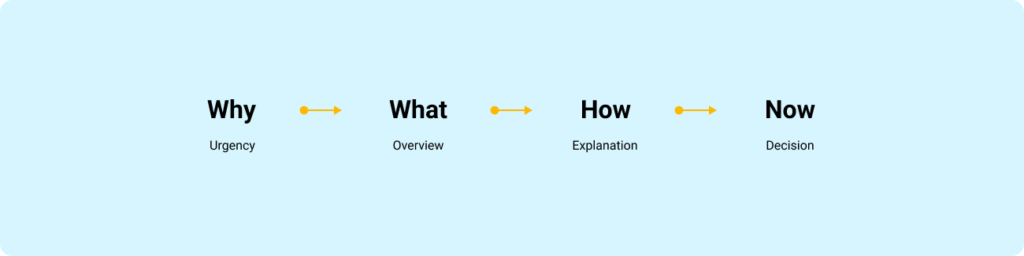
FORMAT is a four-frame flow that matches how people pay attention:
- Why: Why is this important, and why now?
- What: What is the 10,000-foot view? What are the key pieces?
- How: How does it work, and how does it affect the user, the business, or the team?
- Now (Next): What is the one domino you want the group to push over?
This is not a “presentation technique.” It is a cognitive shortcut. It answers the built-in objections in order: Why should I listen, what is this about, how does it work, and what do I do with it.
The in-house reality: slides are optional, signal is mandatory
Here is the rule I use: choose the container that reduces friction for the decision you need today.
When slides are worth it
Use slides when you need compression and durability:
- Executive reviews where people will not open Figma
- Kick-offs where you are aligning on goals, scope, and constraints
- Large updates where the narrative must travel without you in the room
When slides slow you down
Avoid slides for:
- Weekly design progress
- Critiques and working sessions
- Engineer collaboration and handoff conversations
In these contexts, slides often become theatre. The work lives in Figma. Present it where it lives.
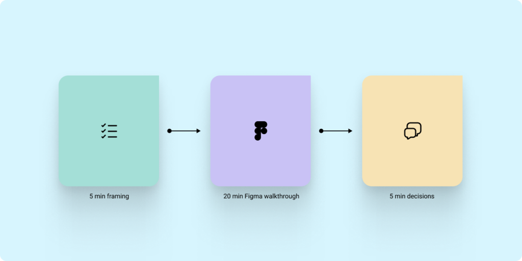
The hybrid model that works: 5 minutes of framing, then Figma for the work
If you are presenting progress to stakeholders or leadership, do this:
- Open with framing (FORMAT) in a single page or a single frame.
- Move into Figma for the walkthrough.
- Close with Now/Next and a direct decision or action.
This keeps the narrative tight without forcing you to build a deck for every touchpoint.
Stop screen share chaos: invite people into the file and control attention
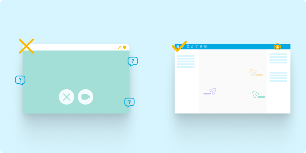
Most in-house presentations fail for a boring reason: screen share quality is not reliable. Zooming in and out, jumping across the canvas, and relying on compressed video creates lag and blur. Stakeholders miss details, then compensate with confusion and side questions.
Instead:
- Share the Figma or FigJam link before the meeting.
- Ask stakeholders to open it so they are in the file with you.
- Use Spotlight (in Figma or FigJam) to keep everyone following your view.
- Use Comments to capture feedback where it applies.
This turns your “presentation” into a guided walkthrough where the artefact becomes the record.
The core structure: Goal, Context, Designs, Ask
Regardless of container, the content needs a consistent wrapper.
Context
What problem are we solving, and what constraints matter?
Goal
Are you sharing progress, asking for feedback, or asking for a decision?
Designs
Show only what is necessary to evaluate the goal. Label explorations. Make comparisons explicit.
Ask
End with the exact input you need. Without an ask, you get noise.
Guide feedback like a senior designer: set constraints and ask better questions
Stakeholders will give you better feedback when you reduce the surface area for opinion.
Set constraints up front
Tell people what is fixed:
- Brand colours, typography, core structure
Then tell them what is open:
- Information hierarchy
- Flow clarity
- Trade-offs between two directions
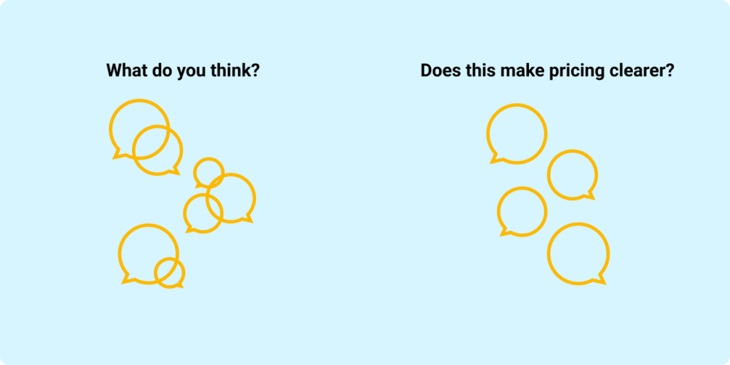
Stop asking “What do you think?”
Replace it with questions that map to outcomes:
- “Does this make pricing clearer?”
- “Would this flow make checkout easier?”
Limit options to avoid decision paralysis
Too many options produce circular debate. Show two, then ask:
- “Which direction is closer to our goals, and why?”
What a strong in-house design progress update looks like
Use this repeatable sequence:
- Why: The user problem and why it matters now.
- What changed: Before and after, in a few screens or a short flow.
- How we decided: The top one or two trade-offs.
- Open questions: The 1 to 3 decisions you need help with.
- Now/Next: The one action the group needs to take.
If you can keep the walkthrough to a small set of examples and finish with a clear decision, you are doing your job.
The point of presenting is progress, not polish
In-house design is a continuous loop of learning and refinement. The best designers are not the ones with the most beautiful decks. They are the ones who can consistently create alignment, capture high-quality feedback, and move decisions forward, using the tools and artefacts the team already lives in.
If this topic resonates with you, or if you are working through how to manage up more effectively in your own design role, feel free to connect with me on LinkedIn or reach out through my website contact form.