It’s time to stop treating UI design as a cost centre and start measuring it as a strategic advantage. When designers ask, “What value does my UI work bring to the business?”, the answer should be clear, structured, and backed by measurable outcomes.
This article is written for designers navigating performance reviews, team impact, or personal growth. If you’re wondering what separates a designer who makes things look good from one who drives meaningful results. Read on.
UI design has always delivered business impact. We just haven’t been great at measuring it
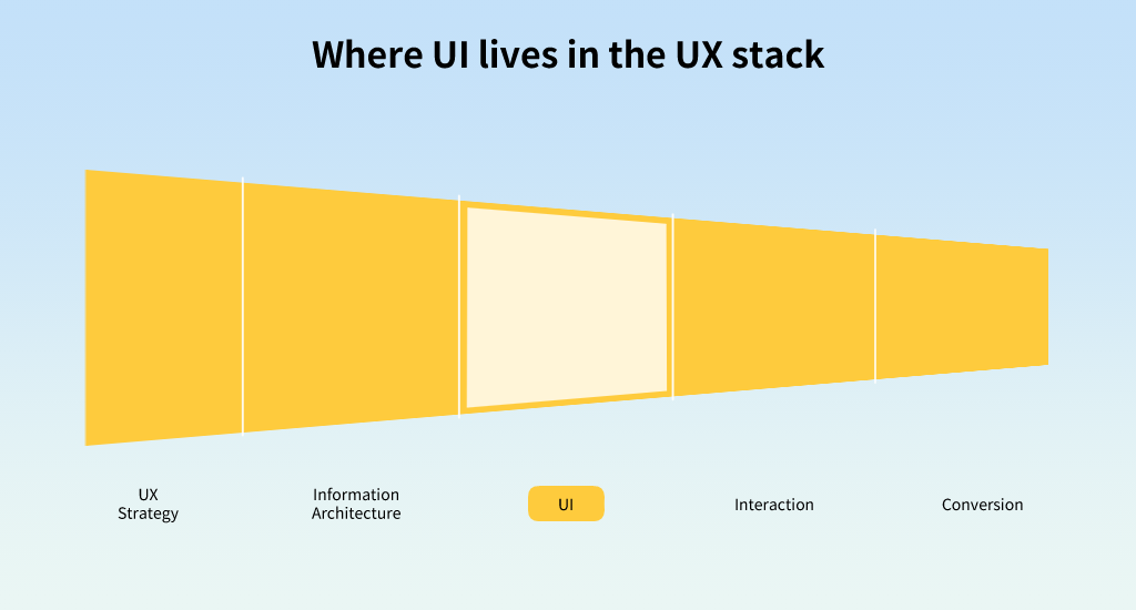
UI design often gets lost in the shadows of broader UX or product conversations. Yet it plays a vital role in shaping the last mile of customer experience, where intention becomes action.
Even the most well-place call to action can go unnoticed if the visual hierchy is unclear, or if micro-interactions fail to guide users effectively. This is where UI decisions become critical to enabling business outcomes.
But to advocate for UI’s contribution, we need metrics that reflect its role in the success of the experience.
Traditional metrics: What we can already track
Design teams already have access to a solid foundation of UI-related performance metrics. These form the backbone of most analytics dashboards and help establish baselines for tracking product health.
Diagram: traditional UI metrics
- Task success rate
- Conversion rate
- Drop-off rate per screen
- Time to completion
- Accessibility score (e.g. WCAG compliance)
- Interaction error rate
- Satisfaction score (via post-task survey or HEART)
- Visual hierarchy scan path (via eye tracking or click data)
But once all this data is collected, the real challenge begins: What does it all mean in context? When some signals are strong and others are weak, designers need to move beyond reporting and into storytelling. This is where clarity of intent becomes vital.
Example:
A redesigned checkout screen increased task success rate from 72% to 91%, with a 23% drop in cart abandonment. The UI change? Simplifying form fields and repositioning error messages.
These numbers don’t just reflect good aesthetics, they reflect business growth, loyalty, and cost reduction.
Align metrics to design intent
Not every metric matters equally for every project. The first step is to clearly articulate the goal of the UI change, so that the right metrics are prioritised.
Start by identifying the primary outcome the design aimed to influence. Then classify available metrics as:
- Leading indicators – directly tied to the design goal (e.g. reduced drop-off on a pricing page).
- Supporting signals – helpful but not decisive (e.g. eye tracking showing improved scan path).
- Lagging indicators – longer-term effects (e.g. higher NPS or retention).
When metrics are in conflict (e.g. drop-off improves but satisfaction dips), tie your interpretation back to the strategic intent. Explain which trade-offs are acceptable in the short term, and which require further investigation.
Example: If your new UI reduced friction and boosted conversion, but satisfaction dropped slightly, that could still be a strategic win. If your business goal was short-term acquisition. But if you’re designing for long-term trust or repeat use, that dip deserves attention.
Where possible, correlate movement across metrics. A stronger case emerges when time-to-completion, conversion, and scan path improve together. If metrics diverge, consider A/B testing or heatmap analysis to understand the root cause before drawing conclusions.
The key is to go beyond reporting numbers. Use them to build a credible, outcome-focused narrative about how UI design contributed to business performance, ****even when the signals are nuanced.
Example:
- Hypothesis: By clarifying visual hierarchy on the search results page, users will make faster decisions and reduce bounce rate.
- Metric: Time to first meaningful click, compared before and after redesign.
- Outcome: A 17% reduction in decision time and higher satisfaction score.
Enter GenAI: The new layer in UI impact
With the arrival of generative AI, personalisation, and adaptive interfaces, UI design now includes algorithmically generated content, layouts, and interactions. This makes measurement more complex, and more important.
Diagram: traditional versus GENAI UI metrics
| Traditional Metrics | GenAI-Era Metrics |
|---|---|
| Task success rate | AI content alignment rate Measures how well AI-generated suggestions match user intent or context. |
| Conversion rate | Intent-to-conversion accuracy Tracks how accurately dynamic content nudges users toward meaningful outcomes. |
| Drop-off rate per screen | Drop-off rate after AI interaction Looks specifically at where users abandon flow after engaging with AI suggestions. |
| Time to completion | AI time saved per user task Quantifies the efficiency gained through AI-generated shortcuts, summaries, or content. |
| Accessibility score | AI accessibility override incidents Tracks how often AI-generated outputs break or bypass accessibility standards. |
| Interaction error rate | Correction rate of AI-generated content Measures how often users need to correct or discard AI responses, indicating quality and trust. |
| Satisfaction score (e.g. HEART) | User trust in AI suggestions Captures the subjective comfort, confidence, or reliance on AI-generated content. |
| Scan path (e.g. eye tracking) | AI interaction entry point Identifies where and how users first engage with AI in the interface and whether it enhances or distracts. |
Measuring the invisible hand of AI
When AI is embedded into your UI — offering smart suggestions, predicting content needs, adapting layouts — its influence can be subtle but powerful. You can’t always measure it with surface-level metrics like clicks or screen flow alone. So how do we trace its impact?
Start by understanding what would have happened without AI. This baseline helps you frame the right questions.
Example:
Let’s return to a hotel search scenario. Traditionally, users are given fixed filters (location, price, amenities) and they manually fine-tune options. As UI designers, we’d track:
- Time to filter application – How long until the user starts adjusting filters?
- Drop-off after applying filters – Did filtering overwhelm them or narrow results too far?
- Completion rate – Did they continue to book?
With GenAI, the flow changes. The system learns what the user values based on their past preferences or real-time behaviour, and dynamically adjusts results or surfaces smart filters before the user asks.
Now, the metric might evolve into:
- Time to confident selection – How quickly do users find something they feel good about choosing?
- Trust in AI-assisted filters – Did the suggested filters reduce effort or confusion?
- Booking likelihood with dynamic filters – Did more users convert when filters adjusted to them?
A UI designer working on a travel platform experimented with GenAI-generated layout variants, different arrangements of filters and content blocks tailored to user segments. The tracked metric? “Time to satisfied decision.” It dropped from 6.5 minutes to 3.2 minutes across key user segments, with no drop in NPS (Net Promoter Score, a measure of user satisfaction and likelihood to recommend).
By comparing these, designers can demonstrate the added value of adaptive interfaces over rule-based ones. GenAI isn’t just a backend boost, it’s a UI shift that reshapes how users perceive, interact with, and trust the product.
What this means for designers
You’re not just crafting interfaces, you’re crafting results. Understanding what to measure, and how to prove your value, is key to evolving your role.
A great UI designer today:
- Designs with measurable hypotheses
- Partners with data and engineering to set trackable goals
- Optimises not just flows, but outcomes
- Understands AI’s role in personalisation and performance
- Knows how to interpret user interaction data
- Can explain how design changes moved a business metric
If your team isn’t tracking how your design work contributed to company outcomes, consider starting that conversation.
Closing thoughts: Metrics as a language of value
We measure what we value. It’s time to ensure the UI design craft is included in the metrics conversation, not as decoration, but as a driver.
The future of UI design is not just about aesthetics or usability. It’s about business impact at scale, informed by data and shaped by AI.