Tag: Booking.com

  • API machine account modernisation

    API machine account modernisation

    Seamless transition to modern API authentication: Enhancing provider security with token-based methods

    Overview

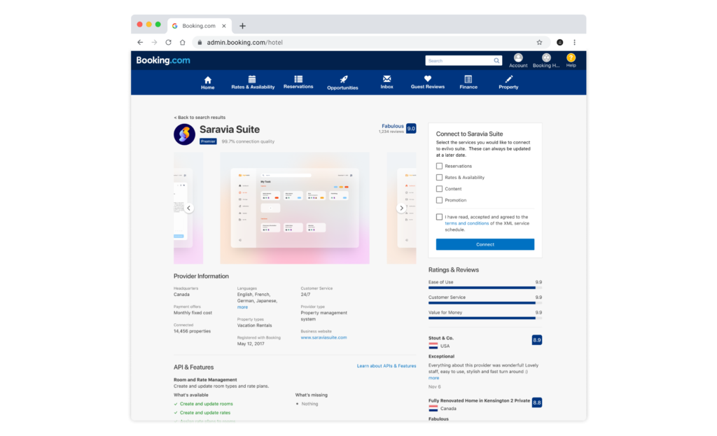
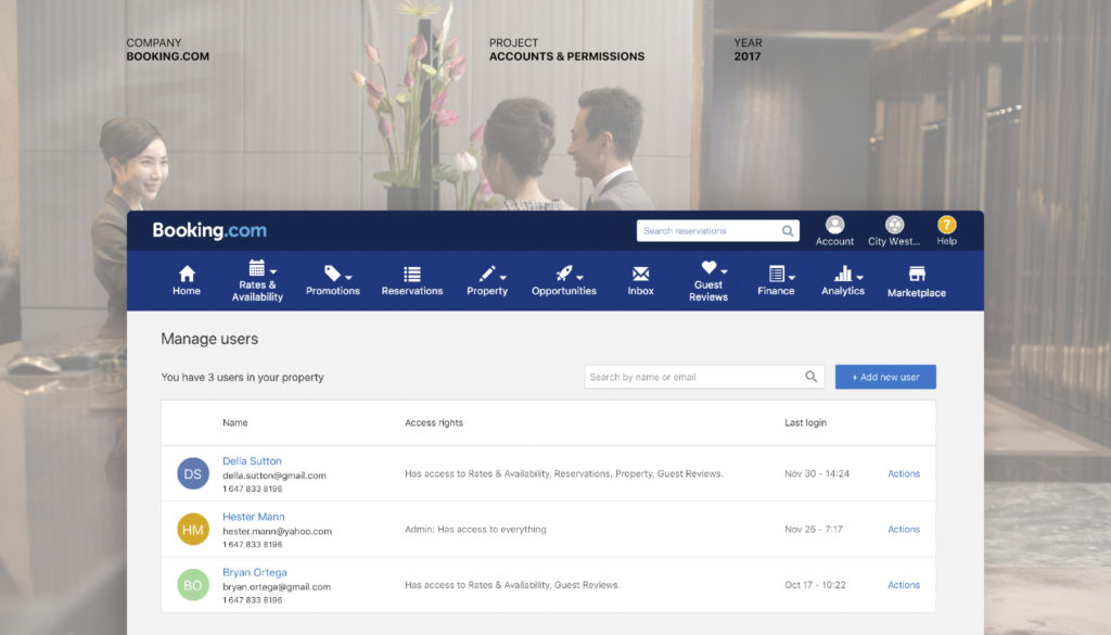
    The API authentication modernisation project aimed to enhance the security and usability of machine account authentication for providers partnered with Booking.com. The existing basic authentication method presented significant security vulnerabilities, leading to the decision to transition to a more robust token-based authentication system, utilising OAuth. This change required providers to adapt their backend processes and configuration setups in the Booking.com provider portal.

    My role

    As the senior UX designer on this project, I was responsible for leading the user experience design efforts, focusing on the provider portal interface. My role included researching user needs, creating intuitive designs, and facilitating communication among cross-functional teams to ensure a smooth transition for providers.

    Team collaboration

    • Project manager: Who oversaw project milestones and stakeholder engagement.
    • Department product managers: To align the project goals with business strategies.
    • Developers and solution architects: For technical feasibility and implementation.
    • Account managers and customer service teams: To gather insights on provider needs and expectations.

    Stakeholders

    • Internal stakeholders: Connectivity teams, compliance officers, and security experts who were crucial in assessing risks and validating the new authentication method.
    • External stakeholders: Key providers whowwould be affected by the authentication changes, and their feedback was essential for refining the user experience.

    Project objective

    The primary objective of the project was to facilitate a seamless migration for providers to the new authentication method, minimising operational overhead and business disruption. Specifically, we aimed to:

    • Ensure providers could easily adapt to the new token-based authentication system.
    • Reduce the risk of errors during the migration process by streamlining the user interface.
    • Create automation features in areas that would be possible for less manual work.
    • Improve overall security and user satisfaction metrics post-implementation.

    Through this initiative, we anticipated an increase in adoption rates and a decrease in authentication-related support queries, ultimately enhancing the experience for providers.


    Problem definition

    The primary challenge was addressing the vulnerability posed by the current basic authentication method for providers’ machine accounts. Although no breaches had occurred, we recognised the critical need to proactively improve security and mitigate any risks of hacking or financial loss for providers. From a business standpoint, securing provider accommodations was vital for protecting revenue, maintaining trust, and reducing operational disruptions.

    As the designer, I was responsible for ensuring the new authentication process not only strengthened security but also provided a seamless user experience. I collaborated with product managers, security teams, and developers to integrate user-centric solutions into the overall technical framework. My role was pivotal in aligning user needs with business objectives, ensuring providers could adopt the changes without impacting their daily operations.

    Constraints

    The project had several notable constraints:

    1. Time constraints: We were required to complete research, design, build, and testing within one quarter. This tight timeline demanded highly efficient cross-team collaboration and rapid iteration.
    2. Technical constraints: Many providers had set up individual machine accounts for each accommodation, which meant migrating each account would require a significant manual effort. This posed a major challenge for the providers’ teams and risked delaying adoption of the new system.
    3. Resource constraints: Limited development bandwidth required us to create a solution that was simple and efficient, both in terms of design and technical feasibility.

    During the research phase, I led provider interviews and surveys, working closely with the development team to uncover specific pain points around machine account management. These insights allowed us to shape a solution that met technical constraints while addressing the needs of the providers.

    Hypothesis

    At the project’s outset, we hypothesised that most providers managed their accommodations through individual machine accounts rather than in bulk. This assumption was based on anecdotal evidence and would imply that providers would face the challenge of migrating each machine account one by one, resulting in a time-consuming and potentially demotivating process. How could we automate these tasks better.

    I lead the research phase, conducting user interviews to test this hypothesis. The findings revealed that the assumption was mostly correct; providers indeed preferred individual machine accounts, largely due to the limitations in the existing bulk management options. This insight was essential for designing a solution that would mitigate the difficulties of manual migration.


    Research and discovery

    While owning the research and discovery phase of the project, ensuring that all research efforts were aligned with our technical, business, and user experience goals. My role involved leading the initial research, conducting interviews, synthesising insights, and collaborating with cross-functional teams to ensure the findings were actionable. By owning this phase, I helped shape a user-centred approach that informed the design and development process.

    Research method

    We adopted a mixed-methods research approach to gather comprehensive insights:

    1. Interviews and surveys: I facilitated user interviews with different types of providers, who manages either hotels, homes, chains, or villas. These interviews helped us understand how providers managed their machine accounts and identified common pain points with the current authentication process.
    2. Persona development: I collaborated with the UX research team to create detailed personas representing small and large portfolio providers, highlighting their specific needs and behaviours in managing machine accounts.
    3. Journey mapping: We created user journey maps to visualise the providers’ end-to-end process in managing authentication for their accommodations. This helped us identify pain points at different stages, from account setup to migration challenges.

    Key insights

    Several key insights emerged from the research phase:

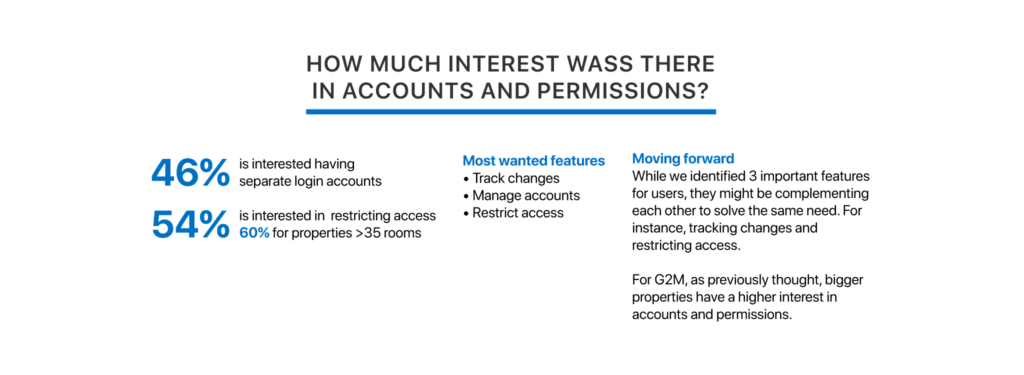
    1. Manual effort concerns: The assumption that most providers would have to migrate each machine account one by one was validated. This insight refined our understanding of the scale of the problem, especially for smaller providers who lacked the resources for manual migration.
    2. Different adoption rates: Large portfolio providers were more likely to adopt the new authentication method if they had bulk migration options, whereas small portfolio providers needed more hands-on support to avoid feeling overwhelmed.
    3. Usability issues: Many providers reported confusion about how to manage their machine accounts effectively, especially when using the current interface. They needed clearer guidance and automation tools for bulk operations.

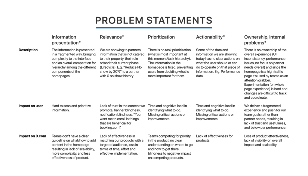
    Based on these insights, we refined the problem statement to focus on:

    • Reducing the complexity of the migration process, especially for small providers.
    • Creating a more flexible and automated solution for large portfolio providers to handle bulk migrations.
    • Improving the usability of the interface to support the diversity in provider needs.

    Problem refinement

    My ownership of the research phase had a significant impact on the project’s direction. By uncovering the critical pain points and validating assumptions, we were able to refine the design and development goals to focus on the most urgent user needs. This ensured that the solution was not only technically feasible but also aligned with how different provider types interacted with their machine accounts. Additionally, the research findings helped the team prioritise the migration challenges that would have otherwise delayed provider adoption, contributing to a smoother project rollout within the given timeframe.


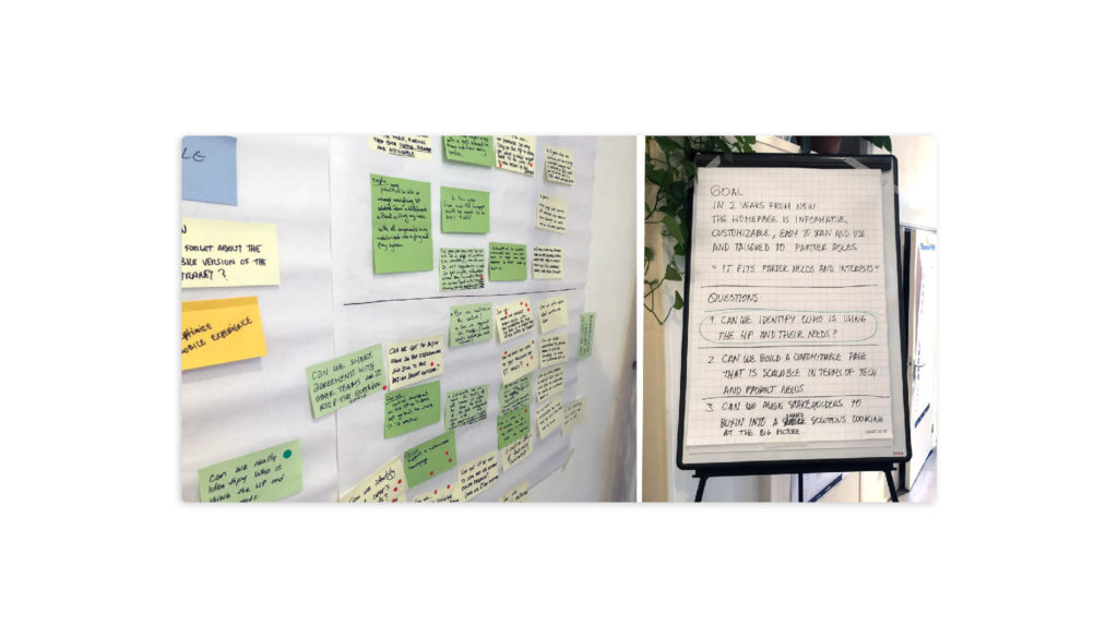
    Ideation and conceptualisation

    Brainstorming and collaboration

    The ideation phase started with brainstorming sessions with the team and key stakeholders to align on potential solutions. My role was to facilitate these sessions by structuring discussions around user needs, technical constraints, and business goals. The brainstorming was crucial for surfacing initial ideas on how we could redesign the machine account management process to integrate API token-based security.

    Approach

    I prepared visual aids and wireframes to support ideation, helping participants envision the new process and offer suggestions.

    To gather diverse input, I also presented the wireframes during design critique sessions with the UX community. Their feedback helped refine the wireframes with broader perspectives on usability and flow.

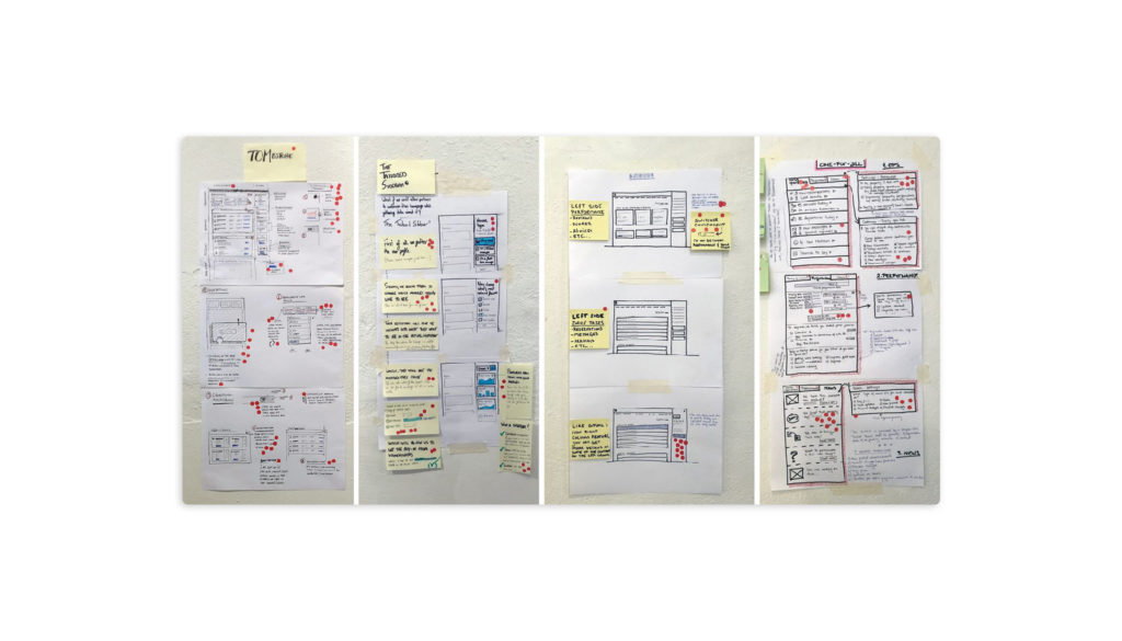
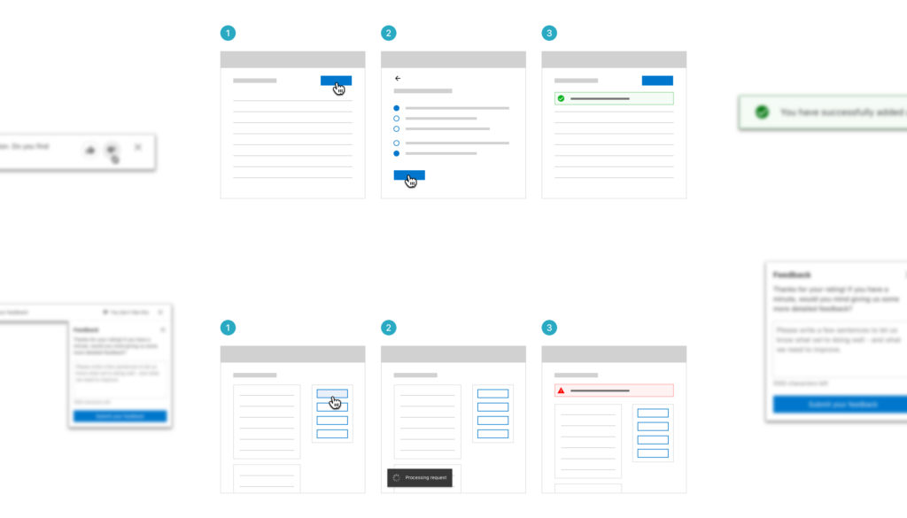
    Wireframing and prototyping

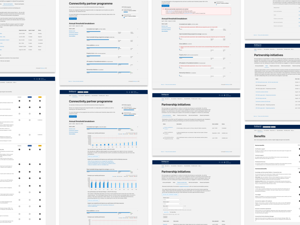
    After solidifying the initial ideas, I transitioned to creating wireframes in Figma. These wireframes outlined the core userflows for creating, managing, and migrating machine accounts, along with potential outcomes (success states, error states, and empty states).

    Process

    I iteratively developed the wireframes, incorporating feedback from the project manager and the team, as well as insights from the earlier brainstorming sessions. I ensured the wireframes reflected the complexity of different user types (small vs. large providers).

    I shared sneak peeks of the designs and gathered initial thoughts, but scheduled formal feedback meetings with the team and the UX community to validate the designs more thoroughly.

    Additionally, I collaborated with our UX writer, to ensure that the UI copy was clear, concise, and aligned with the new flows. This helped ensure a unified experience between design and content.

    Feedback loops and refinements

    To ensure the designs were practical and user-centric, I engaged in feedback loops from both colleagues and providers. The Booking.com team provided technical insights that guided revisions, ensuring the wireframes were feasible and secure. Meanwhile, feedback from the UX critique sessions offered insights on the user experience and usability improvements.

    Impact of feedback

    The feedback sessions helped refine the userflows, making the migration process more straightforward, particularly for small providers who were intimidated by the scale of the migration.

    Suggestions from the UX community led to improvements in the error and empty states, ensuring they provided actionable guidance instead of just technical explanations.

    Based on input from the provider tooling team, we adjusted the migration flow to allow bulk actions for large portfolio providers, reducing the manual effort required.

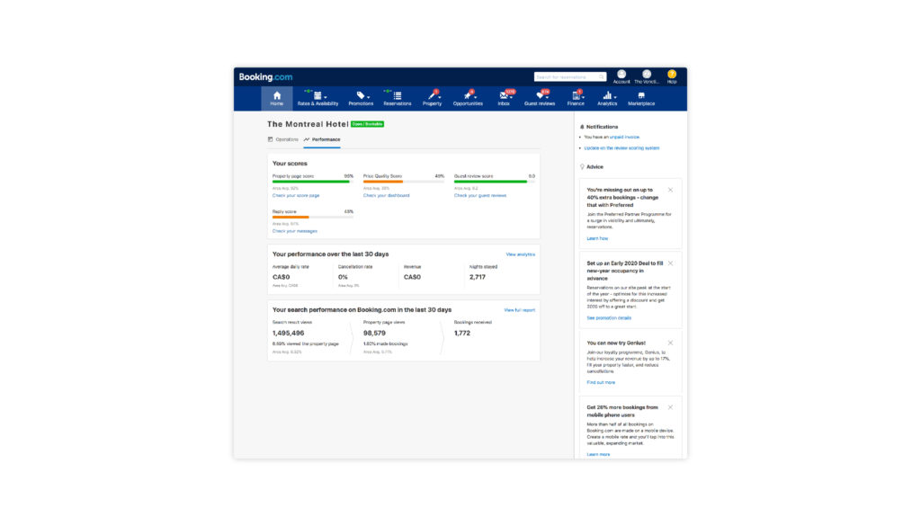
    Prototyping and testing

    Once the wireframes were in a solid state, I developed high-fidelity prototypes in Figma. These prototypes were used to simulate the actual experience for stakeholders and gather additional feedback before final implementation.

    User testing preparation

    I collaborated with Giulio to create a discussion guide for the upcoming user testing phase. This document helped us focus on the critical areas of the flow that required validation.

    The prototypes and flows were shared with our UX writer again to ensure that the content would resonate with the providers’ needs.

    Final outcomes

    The ideation and conceptualisation phase culminated in a set of high-fidelity wireframes and prototypes that:

    • Simplified the machine account creation and migration process for all provider types.
    • Integrated comprehensive error handling and success messaging for a smoother user experience.
    • Incorporated feedback from multiple rounds of internal and external reviews, ensuring alignment across the team.

    My proactive approach in gathering feedback loops at different stages of the design process enabled us to address challenges early, resulting in a more robust solution. This process not only strengthened the final product but also ensured that our design would meet both business goals and user needs efficiently.


    The project concluded successfully, ahead of schedule, with the majority of key milestones completed in just over two-thirds of the original timeline. This accelerated progress allowed the development team to commence the build phase earlier than expected, with a detailed spec sheet outlining every phase of interaction. By ensuring that all phases were well-documented and signed off, I eliminated any ambiguity or missed steps, significantly reducing the need for follow-up questions and enhancing the team’s efficiency. One of the critical outcomes was securing alignment between the project manager and leadership regarding the build priorities, ensuring that all phases were clearly mapped to support a smooth and successful launch.

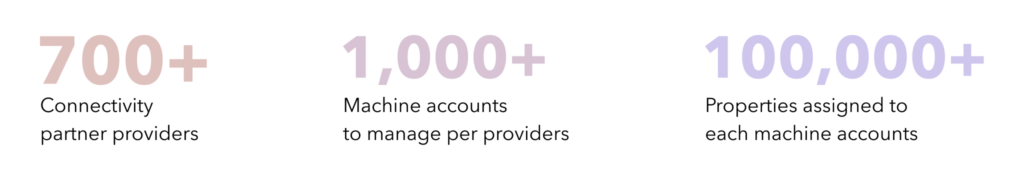
    In preparation for the launch, I worked closely with the customer support team to develop FAQ documents and answer any potential questions from our providers. This proactive approach ensured that our 700+ providers had access to comprehensive resources, which facilitated a smooth migration process. The impact was immediate, with over two-thirds of our provider portfolio completing the migration in the first quarter following the launch. Providers with more complex setups, particularly those managing larger accommodations, understandably took longer, but the overall feedback was overwhelmingly positive. Providers expressed satisfaction with the ease of use and appreciated the level of support offered during the transition, allowing them to return to their business operations with minimal disruption.

    Reflecting on my role in leading this project, I recognise that the success was largely attributed to a vigilant approach to process management and a clear understanding of what success looked like from the outset. By gaining the trust of my peers and leadership, I was able to guide the team through meticulous planning and execution, ensuring that all aspects of the project were aligned with our business goals. Additionally, I leveraged the expertise of key roles across departments, which allowed me to anticipate challenges and address them proactively. This holistic approach not only ensured the timely delivery of the project but also cemented strong relationships with both internal teams and external stakeholders. The experience reinforced the importance of cross-functional collaboration and adaptability in leading successful projects.

  • Steering metric

    Steering metric

    THE TOPIC

    In spearheading the design of new pages within the Booking.com connectivity hub platform, the primary objective was to empower our connectivity partners with accurate and timely metrics, aligning seamlessly with my role as a senior UX designer. This initiative aimed to address critical gaps in our ability to positively influence the Booking.com programme and connectivity track goals for 2024 and beyond. The overarching goal was to enhance partner performance in key areas such as API adoption, booked room nights (ABRN), open bookable listings, and gross additions. This project serves as a testament to my ability to plan and lead design activities for complex products.

    • Strategic vision and leadership
    • Cross-functional collaboration
    • Product strategy and planning
    The areas of impact this project would had brought to the business

    THE PROBLEM

    The project addressed a historical gap on two fronts: firstly, the absence of a clear, accessible set of actionable insights for our partners hindered our ability to steer their business effectively. This not only impeded our capacity to drive business growth through our partners but also led to missed opportunities for performance improvement. Secondly, our partners, especially those without account manager support, perceived the metric improvements we shared with them as solely benefiting Booking.com’s business growth. To overcome this challenge, I undertook the task of designing pages that not only presented data but also educated partners on the business impact of improving these metrics. This approach aimed to help partners enhance their own performance while contributing to our overall success. In my role as a senior designer, I not only addressed the core problem but also tackled the perception issue among partners without account manager support. This showcases my ability to manage stakeholder expectations up to the director level.

    • Problem-solving and innovation
    • Stakeholder management
    • Educational design

    MY APPROACH

    My approach centred on delivering both depth and breadth of actionable insights. Collaborating with a UX writer and researcher, I conducted insightful brainstorming sessions with key stakeholders within the company, a pivotal step reflecting my role as a senior designer contributing to the overall track strategy. Together, we meticulously mapped out the content strategy, ensuring each metric was distinctly understood within the context of our business goals. This collaborative process involved crafting a narrative for the project, showcasing my adeptness in building consensus between teams and stakeholders. Subsequently, I conducted user testing sessions targeting a diverse range of partner segments, including those in our top and lower tiers, within hotel or home segments, and managing either a single system or multiple company systems. These sessions not only validated the design and narrative but also affirmed the creation of a user-friendly, self-service tool for our partners.

    • User-centric design
    • Strategic collaboration
    • Agile methodology

    THE IMPACT

    The overall outcome was uniformly positive. Partners, spanning from top-tier to lower-tier, within hotel or home segments, valued the additional data points. This positive result effectively showcased the impact of my work, surpassing expectations. The design seamlessly catered to partners handling single or multiple systems, illustrating its scalability. Following the launch, notable improvements were observed, including increased accommodation availability, reduced churn, and closed properties, underscoring the effectiveness of the newly implemented steering metric pages. This success highlights my proficiency as a senior designer, adept at navigating organizational complexities and contributing to larger, more intricate product features.

    • Positive outcome and exceeding expectations
    • Scalable solutions
    • Organisational proficiency

    MY CONTRIBUTION

    My involvement ensured the alignment of the project with business objectives and timelines. By incorporating a research process, I validated our hypotheses, ensuring the solution resonated with user needs. This strategic approach yielded positive responses directly from our target audience, highlighting my ability to transform insights into innovative features. The final solution not only addressed the initial problem but surpassed expectations, resulting in increased accommodation availability and reduced churn. My profound expertise in the connectivity track, coupled with my leadership skills and understanding of design systems, played a crucial role in delivering a high-impact solution and adhering to business objectives and timelines.

    • Strategic alignment and leadership
    • Research and insight implementation
    • Effective communication and leadership
  • Connectivity partner programme 2023

    Connectivity partner programme 2023

    THE TOPIC

    As the senior UX designer leading the connectivity partner programme project at Booking.com, my primary goal was to enhance our engagement with third-party partners, commonly referred to as providers. The focus of the project was to transform our existing point-based system, historically rigid and challenging for smaller providers, into a more flexible threshold programme. This initiative, a cornerstone of partner interaction, centers around key metrics crucial for partner growth and optimal service for their connected accommodations, often referred to as clients.

    Make it easier for everyone to experience the world through technology

    — Connectivity partner programme mission

    The programme plays a pivotal role in our ecosystem, with providers ranging from large-scale businesses to smaller enterprises specialising in unique system software. The challenge lay in the historical structure of the programme, where the point-based system posed difficulties for smaller providers in achieving meaningful engagement. These smaller providers, integral to Booking.com, play a vital role in ensuring the seamless integration of our tools within their systems, enhancing the experience for their connected accommodation clients and contributing to a diverse range of offerings.

    Recognising the limitations of the existing structure, my approach aimed to create a more inclusive and adaptable system that accommodates the diverse needs of our partners.

    • Business impact
    • Design strategy
    • Understanding customer needs
    The connectivity partner programme of 2022, where it was based on a point system

    THE PROBLEM

    The historical point-based system, while effective for large-scale provider partners, presented challenges that hindered the engagement of smaller businesses. These challenges, which included smaller accommodation portfolio sizes, fewer regional or international clients, or having different business objectives then the standard provider, prompted the need for a transformative solution. Following comprehensive user research, strategic discussions, and leadership approvals, we made the strategic pivot towards a threshold programme.

    The primary goal was to address the limitations of the historical system and create a more inclusive programme that accommodates a diverse range of partners, including those dealing with home or hotel properties and specialised software providers. This transformation aimed at providing flexibility for all partner types, enabling them to actively contribute and progress within Booking.com’s connectivity tier levels. This shift was instrumental in allowing each partner to undertake activities throughout the year, forming the backbone of our platform. In doing so, we ensured that partners of all sizes could contribute to a diverse array of high-quality offerings for our users and their accommodations.

    • Understanding customer needs
    • Communication and stakeholder management
    • Org complexity

    MY APPROACH

    Understanding the diverse partner landscape, I initiated a value proposition session with key stakeholders to define partner segments, including Hotel, Home, Specialised, and Direct to Home provider types. This segmentation allowed us to set realistic and feasible targets for each category.

    The segments:

    • Hotel segment Partners that support accommodations that specialized in the large hotel industry, including chains.
    • Home segment Partners that are focused in supporting accommodations that offer full property rentals and are dependent of seasonal calendars.
    • Specialised segment These partners business focus are not about booking, but about providing their accommodations to be able to maintain their business profile like messaging, content and reviews.
    • Direct to home segment These home partners are different from the other type of home segment partners since these partners are in-house owned. They solely build all their system for their own accommodations. Which makes them the clients and the owner of their own business.

    The next step involved a collaborative brainstorming session efforts with data scientists to explore alternatives to the point system, ensuring a realistic and feasible focus for each. Through whiteboarding user flows and exercises like “crazy 8ths,” we devised a threshold system tailored to each segment’s metrics and goals. This would create fairness and engagement across all partner segments. This comprehensive approach was essential for garnering support from stakeholders and ensuring that the redesigned programme would meet the diverse needs of partners, including individual segments like Home, Hotels, Direct to home and Specialised provider types.

    • Design strategy
    • Innovation and complexity

    THE IMPACT

    The implemented solution featured progress bars with two-step points for each metric, ensured fairness across all segments allowing partners to progress from Standard to Advanced and Premier tiers. The success of the user-friendly approach result was measured by monitoring key indicators post-launch.

    The results were transformative:

    • Increased participation and open bookable listings
    • Positive satisfaction survey scores
    • Higher partner engagement throughout the calendar year
    • Reduced support tickets and hand-holding tasks for account managers

    Think customer first: You alway think of how the platform and its experience can add value to the user and involve all the relevant stakeholders to get their input. Succeed together: You are involved in most of the initiatives surrounding connectivity hub and are clearly able to spot opportunities on the multiple touch points across the platform.

    — Peer feedback

    I also implemented a profile modification window, allowing partners to adjust their segment alignment within a specific period, preventing potential exploitation. The new analytics dashboard reflected reduced support tickets, longer partner engagement, and more frequent visits every month. These tangible outcomes demonstrated the effectiveness of the redesigned programme in addressing partner pain points and promoting sustained engagement among a diverse partner segment community.

    • Design creation
    • Org complexity

    MY CONTRIBUTION

    My proactive leadership, collaboration with stakeholders, and adherence to timelines played a pivotal role in the successful launch of the redesigned connectivity partner programme. Leveraging my expertise as a UX designer and connectivity knowledge, the initiative not only effectively addressed partner pain points but also made a substantial contribution to Booking.com’s profitability. Post-launch success was quantified through metrics, including notable increases in overall business growth, satisfaction survey scores, and active providers. The results surpassed expectations, with enhanced participation, streamlined support efforts, and positive engagement metrics. Beyond numerical achievements, this success stands as a testament to the programme’s positive impact on the diverse provider partner community, ultimately improving the user experience across the platform.

    • Business impact
    • Individual impact
    • Community
  • Connectivity provider matchmaking

    Connectivity provider matchmaking

    Image cover of an hotel icon with radius loops connecting everything together.

    THE TOPIC

    Goal of the project was to make it easier for property owners to find the right portfolio of technology solutions to grow their business. By putting customers first and using our proprietary data to generate a curated list of recommended providers, properties can make an informed decision. The idea behind this project was to make it easier for different property types (hotels, homes, chains, etc…) to find the right provider (channel manager, property management systems or revenue management systems) type to grow their business with. We want to  recommend providers with a demonstrated history of strong business performance and early API adoption – all while respecting property needs and explicit choices.

    THE PROBLEM

    According to our annual partnership survey, around 50% of the participating properties were interested in a connectivity provider and expected advice from Booking.com to assist them to pick the right one for them. This made me realise that there was a huge property need in the market.

    Thus, I planned an in-depth property owner interview to follow up on these needs. The most important learning was to understand properties’ expectations from Booking.com. Properties saw our platform to be the top expert in the accommodation industry and that meant we had tons of data and knowledge of all the providers collaborating with us. Many of our property owners didn’t have a main source of reference in understanding the difference between one provider and the other. Therefore, properties were heavily relying on friends’ recommendation, word of mouth, Google searches or just trying out as many trials as possible from different providers. That was extremely time consuming, but the biggest challenge for property owners was that they still couldn’t make a confident decision on their search towards the right provider.

    MY APPROACH

    Currently in the property renting industry, there is nowhere available an intuitive platform/tool for property owners to learn about all the providers across different countries. Therefore, at Booking.com, we have the opportunity to be the first one that provides property owners this platform/tool.

    One great learning from property interviews is that the property type is a main factor when it comes to picking the right provider. Property owners are looking for providers that have advanced experience in their property type. For example, a home rental property will pick a provider specialised in holiday home rental services.

    Another factor is the presence of local customer service. Properties prefer providers that offer support in their locations and languages. On top of that, reviews from previous or current properties are essential. In the reviews, property owners would like to have screenshots of the management tools and its features. These details are crucial for their decision making.

    Onboarding

    New and experienced properties needed help understanding the potential use of all types of providers and our Booking website just like any other platform across the internet, wasn’t providing a single source of truth to reference for properties on all the available possibilities.

    Contextual advice

    Once all property owners understood what to look for in a provider, we needed to provide a logical list of results of providers best suited for each property type, where the provider would offer services that would be specialized in the property business growth, location, scale, flexibility with services and needs.

    Discoverability

    Next step was to conclude the journey by providing a complete profile description of who the provider is, what they offer and how to connect with them.

    This enabled the product managers to set timelines when to test each topic in our sprints plannings. We needed to first move backwards and build the foundation to improve the profile pages (discoverability), then move towards the provider selection (contextual advice) page where we list all potential candidates and then complete the project by creating a complete library of resources (onboarding) to help properties make better decision in who to connect with.

    THE SOLUTION

    My extensive knowledge of all the available data we were collecting on the providers, helped break down the profile experiments. I created variations of the profile page, by updating the content with current data that was being shared with properties and testing its improvement with increasing connection requests by properties. Once that was completed and showed no increase in customer support requests and observing no spike on the  connection requests between properties and providers, I moved on to start connecting new missing details from the providers.

    To resolve the process of property owners going through social media channels or word-of-mouth processes, I started creating a process in building a review system on providers by properties. This helped properties get relevant insights from their own peers in the same industry. All these improvements showed increased connection requests by building a richer profile description of the providers.

    While the discoverability topic was being completed, I  took the opportunity with the help of our data scientist to map out the metrics to use when listing provider ranking. We validated the improvements of the matchmaking recommendation ranking through multiple phases and I followed up with a brainstorming session with key stakeholders across teams to agree on which categories to use. This led to creating a Google Sheet table that was pulling our data and rules, so they can be first shared internally with the product managers to test and refine the bugs or results.

    Once this action was performed a few times, we ran an experiment with our old provider selection list and compared randomized results with our new algorithm ranking. This showed positive results, when comparing the length of connection of properties with providers between both pools. The properties that connected through the ranking results stayed connected longer while the properties who connected through the randomized results would switch or cancel their connection after a month or two. So these findings help me confirm that the algorithm was working better and concluded the contextual advice topic.

    On the onboarding topic, I re-wrote all of our existing documentations and with the help of internal resources and discussions with key stakeholders, I was able to visualise what properties should look for when choosing a provider. When the onboarding phase was validated through property interviews on ease of understanding, 9 out of 10 properties were able to explain what was each type of provider and which features a provider could offer when selecting them for their business. Afterwards, we ran an experiment with a wider audience of properties and tracked the increase in connection requests to providers and switches from providers with limited features to others that provided a wider variety of functionalities.

    THE IMPACT

    My lead on this project fulfilled the need for easy accessible, relevant and trustworthy information for the properties. Creating a single source of truth for properties, helped reduce the amount of effort and time they spent to do proper research and enabled them to compare providers before selecting the right one. Because in the past the information sources were scattered and not always trustworthy, with matchmaking I was able to optimize the properties time spent in finding a provider, increasing their trust on Booking.com knowledge and expertise.

    My initiative helped fill the gap of knowledge regarding tools and capabilities for properties. However, besides helping property owners to select the right provider, I enabled Booking.com to play a stronger role for less experienced properties, helping them to understand which features they need to look out for, for their specific business.

    An important aspect of this project is the incremental business value this can bring to Booking.com. With the choice of the right provider, properties can increase significantly their revenue which creates a win-win situation for both properties and Booking.com.

    MY CONTRIBUTION

    Because of my experience in understanding what were the missed opportunities and pain points of properties, along with the business goals to increase connections between properties and providers, I was able to provide an improved management tool to increase connections for new and experienced properties to use and get all stakeholders to agree on its need and positive impact to our properties. Our connection requests increased by ~3.5% since its release and our follow up research proved that connected properties have been more satisfied with the recommendations of which provider would best suit their property type.

  • New extranet homepage

    New extranet homepage

    Two wireframe grids illustrating the new look of the extranet homepage

    THE TOPIC

    The homepage of Booking.com extranet provides an overview of the business performance for our property partners. It also serves as an entry point for actions upon the different aspects of their business. Part of the homepage experience is to guide partners to manage their operations, understand their performance and identify opportunities to improve their business. Homepage answers “What’s my current business situation?” in an important summary format.

    THE PROBLEM

    At Booking.com, our partners were seeing three different homepages depending on their property types. It would contain operational notifications, business opportunities, product promotions, performance data and B.com promotions in an unstructured format. The reason was because we had more than 20 teams working on a single topic. Without a proper restructuralization, it was getting more difficult for these internal teams to maintain one useful product for partners.

    The homepage was the 2nd most visited page (excluding login) on our property admin site. However, according to our traffic data, the majority of the partners would skip the homepage and jump to other pages right away. By doing this, they missed out on tons of business insights, opportunities and lacked understanding of their own performance.

    The usage of this page was super low. The structure of the info on this page was also very complicated, because it aimed to target all types of property owners by showing them different versions of the homepage (owners, experts, novices, professionals, entrepreneurs, you name it). Our goal was to transform the homepage as a partners’ daily task operational guide, and the place where they view insights of their business improvement.

    MY DESIGN THINKING

    I led this project by rebuilding the extranet homepage to provide a better experience for our partners, because there were more than 20 teams adding their products in the homepage. My job was to set up the right base and maintain consistency across all products, because partners didn’t care about what happened behind their screen. They just needed one intuitive and useful homepage.

    But before reaching a solution, I deep dived into our traffic data and other behavioural data to understand why our partners skipped the homepage. I brainstormed with all relevant teams running products on the homepage to understand their target segments and how they defined partners with their products. This exercise helped me prioritise the features of the homepage in the later solution stages.

    I also audited and synthesised previous research. From my analysis, I realised that our partners wanted the homepage to be relevant, customisable, actionable and informative but also unique to their business. Thus, the top requirements were to display to the homepage an overview of the partner business with B.com and serve as an entry point for all actions within the different aspects of their business. Based on these requirement, I helped my team redefined the problem statement and agree on a final proposal with the stakeholders from the relevant teams.

    As a next step, I planned a four day design sprint with the key stakeholders, to ideate on the problem. We reflected around the idea of providing a more scalable, easy to use and easy to maintain homepage experience for our partners. We explored this by running an exercise to understand, ideate and test ideas with partners based on the following challenge:

    How can we enable/empower partners to have a clear overview of their business through a homepage experience that is relevant, actionable and easy to use, while being scalable and effective for our product teams who work on it.

    There were 3 takeaways from this design sprint:

    • A shared definition about what is the homepage and align teams around it.
    • Identify possible areas of improvements considering the different type of users beyond the accommodation type.
    • Prototype ideas and test with group of partners to define next steps of our homepage.

    I documented the outcome of the sprint, reviewed and aligned with stakeholders followed by defining product roadmap with my product manager. I also did a UX and technical audit (cover all the states of the homepage, desktop and mobile), defined product features, and both qualitative and quantitative testing to make sure our launch of the new beta version.

    THE SOLUTION

    During the session, I came up with the idea of adding our content in two separate tabs for ‘Operations’ which would have their daily activities (checkins, checkouts, guest reviews and messages) and ‘Performance’ which would show key business metrics with B.com in a snapshot.

    Even thought we had multiple personas and segments using our site. I wanted to avoid offering a customisable structure where they could turn on/off blocks based on their preferences. The reason was that long-term, it would have created missed opportunities for our partners and our internal teams to provide helpful insights to our partners business improvements when needed. My interest was to create a better grouping in our content to be accessible through a simple click away when needed. I also helped in creating guidelines and tips for our internal teams to follow when adding new content within the homepage.

    THE IMPACT

    The homepage redesign brought  positive impact for all partners from all segment globally, such as home and holiday rental, big globe hotel chains like Hilton. We used quantitative way measuring the impact. The primary metric was customer service inbound. Accommodation service tickets per property per day was conclusively non-inferior. I also looked at our critical business metric, net revenue of bookings, which showed an increasing. The satisfaction feedback with the new page (collected through quantitative experiment) was positive. I expected the engagement to be higher at the beginning due to the novelty effect. But I was seeing twice as much interaction with the new homepage, measured in unique events per homepage session in Google analytics.

    MY CONTRIBUTION

    This was a hyper scale project with a great amount of stakeholders. As the lead designer, I successfully designed all user flows and rebuild information architecture. I did an excellent executive work including building a consistent interface, delivering all working files to developers to secure the quality. I kept updated all our related teams at B.com by sharing learnings and giving presentations. I contributed in building the homepage product guidelines for teams to maker sure we deliver to partner one useful product.

    Two people looking at a mobile device and tablet.
  • Design system

    Design system

    A laptop displaying the new Booking.com design system guidelines

    One source of truth for guidelines and documentation

    The problem

    At Booking.com, our design community is over 200+ designers that work alongside in creating a seamless experience for all users from guests booking their upcoming accommodation, to properties uploading their availabilities in their calendar from desktop to mobile or an app. So how do we make sure that all designers don’t constantly reinvent layouts and interactions across platforms and departments?

    My design thinking

    Collaborating with one of our principal designers, for several months we worked together in writing down multiple documentations around guidelines for building partner facing products. I achieved this by doing research with already documentations created out in the outer webs. Listing all common topics that needed to be covered, did an audit of our extranet and added missing topics that separated us from other businesses guidelines.

    Wrote first drafts on all topics, did a community design feedback session to revue if our communication was clear and easy to use. Collected all the feedback shared and did iterations to evolve thanks to their feedback and input. Once the drafts were covering all scenarios, we collaborated with our internal copywriters to sign off on our grammar and spelling.

    The solution

    I took the task to compile all documentation around guidelines for building partner facing products. To help the designers working at Booking.com, to reference in best practices, guidelines, localisation and more. All this was compiled into an internal website that anyone at the company could access and use as reference.

    Who would this impacted

    This helped all graphic, web and user experience designers. It also was picked up by front end developers across our global offices.

    My contribution to the project

    Building this solid foundation of one source of truth for all creative departments turned out to help all designers building a unified experience across all pages and devices. This also became a helpful tool for developers to reference and create an alternative version for themselves to reference in best practices of coding.

  • Accounts and permissions

    Accounts and permissions

    An hotel desk employee helping two guest check in

    THE TOPIC

    At Booking.com, as we strive to give partners (property owners) a frictionless experience, we originally had our extranet setup to only support one account (user) per property. From previous research we knew there was an interest in having the possibility of creating accounts and controlling their permissions, both from a partner and company perspective.

    THE PROBLEM

    So why did partners want to have multiple accounts? According to my research and analysis, the limitation of single account was that properties had to share their username and password with their whole team. Allowing for everyone to have full access across the property account on the extranet was risky. There was also the fact that on each login attempt, there was a 2FA security check which would be sending a temporary code to the account owner’s phone and they could have been absence for many reasons like not at the office or out of their working hours. Then the login process was a painful blocker for their business.

    If passwords were shared between employees, if one of their employees would quiet or get fired. The password would require to be changed immediately and shared again with the rest of the team. If there was a malicious current or ex-employee wanting to change details on the property account, there wouldn’t be any way of tracking who did the changes.

    MY DESIGN THINKING

    I needed to understand more detailed requirements why partners wanted to do with the capability of having multiple accounts connected to their properties. I decided the best way was via a qualitative user interview research. The interviews help me know what actions users were performing on their extranet accounts. For example, in order to be able to manage the accounts themselves, including restricting access were important features for them.

    Through a survey, I wanted to understand who was interested at a property type next. If the features they were most interested changed between property size, team size and type. As expected from the results, the larger properties were more interest in the possibilities of having these accounts and permissions. But the most important features was still about tracking user activity, the ability to manage accounts themselves and choosing permissions for each user.

    THE SOLUTION

    I created a user flow and design for the new extranet feature where partners would create and manage additional user accounts and tailor the permissions for each user individually. I believed this change of allowing properties to manage more then one account and control their permissions was going to be beneficial because it would allow partners to manage accounts autonomously. It would increase security, as partners would not need to share anymore one username/ID and password among members of their team. It would also be easier for us at B.com to tailor a more personalised interaction with them, by using our role options provided. So when they visit the extranet or receive communication from B.com it would be more relevant.

    THE IMPACT

    This new feature was going to be optimised to use for individual properties. Depending on the success and perceived value for our partners, this would possibly had been further improved with more functionality and the ability to manage our more complex level of properties (group accounts).

    The product was launched to all listings worldwide, with one exception being the group accounts. The initial feature is optimised for individual listings. To create or manage group user accounts, the procedure still remains broadly unchanged and B.com needs to be contacted for assistance because of its large complex scale.

    MY CONTRIBUTION

    Because of my effort in creating a frictionless experience for partners to create and maintain their work more efficiently and improve their security. It was a huge improvement for them all. Our customer service tickets went down in creating multiple accounts, it also reduced submissions of partners having lost their password and someone login into their accounts without their awareness. Partners felt more secured and could monitor any discrepancy themselves.

    A quote saying "Do what's right, not what is easy"