THE TOPIC
The homepage of Booking.com extranet provides an overview of the business performance for our property partners. It also serves as an entry point for actions upon the different aspects of their business. Part of the homepage experience is to guide partners to manage their operations, understand their performance and identify opportunities to improve their business. Homepage answers “What’s my current business situation?” in an important summary format.
THE PROBLEM
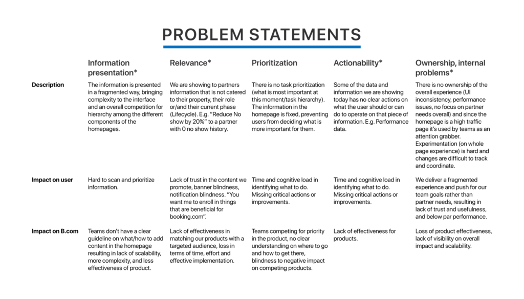
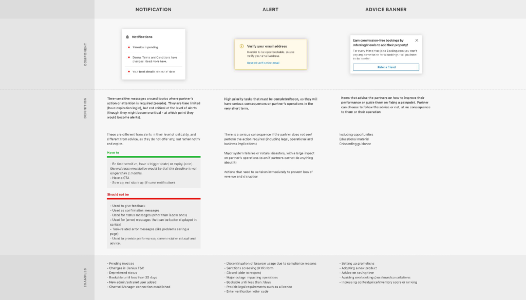
At Booking.com, our partners were seeing three different homepages depending on their property types. It would contain operational notifications, business opportunities, product promotions, performance data and B.com promotions in an unstructured format. The reason was because we had more than 20 teams working on a single topic. Without a proper restructuralization, it was getting more difficult for these internal teams to maintain one useful product for partners.
The homepage was the 2nd most visited page (excluding login) on our property admin site. However, according to our traffic data, the majority of the partners would skip the homepage and jump to other pages right away. By doing this, they missed out on tons of business insights, opportunities and lacked understanding of their own performance.
The usage of this page was super low. The structure of the info on this page was also very complicated, because it aimed to target all types of property owners by showing them different versions of the homepage (owners, experts, novices, professionals, entrepreneurs, you name it). Our goal was to transform the homepage as a partners’ daily task operational guide, and the place where they view insights of their business improvement.
MY DESIGN THINKING
I led this project by rebuilding the extranet homepage to provide a better experience for our partners, because there were more than 20 teams adding their products in the homepage. My job was to set up the right base and maintain consistency across all products, because partners didn’t care about what happened behind their screen. They just needed one intuitive and useful homepage.
But before reaching a solution, I deep dived into our traffic data and other behavioural data to understand why our partners skipped the homepage. I brainstormed with all relevant teams running products on the homepage to understand their target segments and how they defined partners with their products. This exercise helped me prioritise the features of the homepage in the later solution stages.
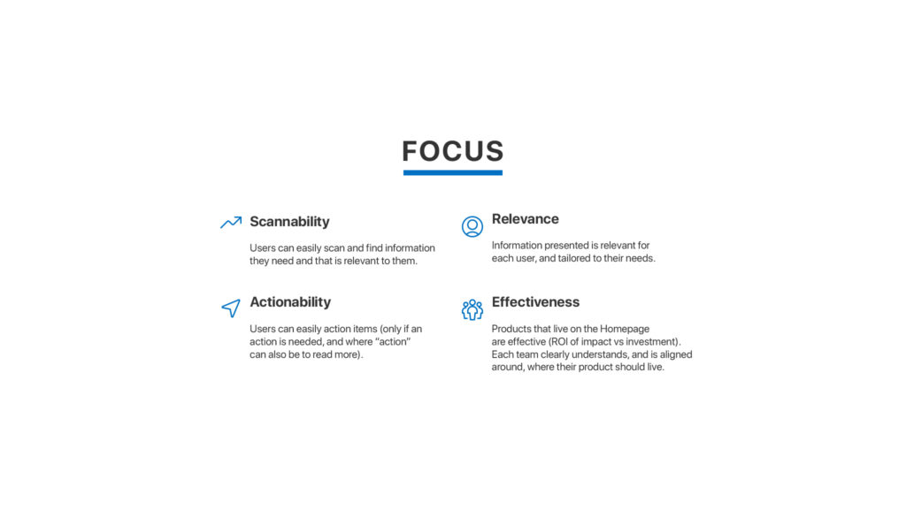
I also audited and synthesised previous research. From my analysis, I realised that our partners wanted the homepage to be relevant, customisable, actionable and informative but also unique to their business. Thus, the top requirements were to display to the homepage an overview of the partner business with B.com and serve as an entry point for all actions within the different aspects of their business. Based on these requirement, I helped my team redefined the problem statement and agree on a final proposal with the stakeholders from the relevant teams.
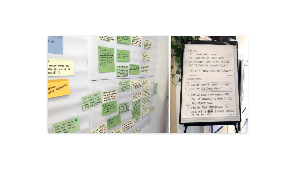
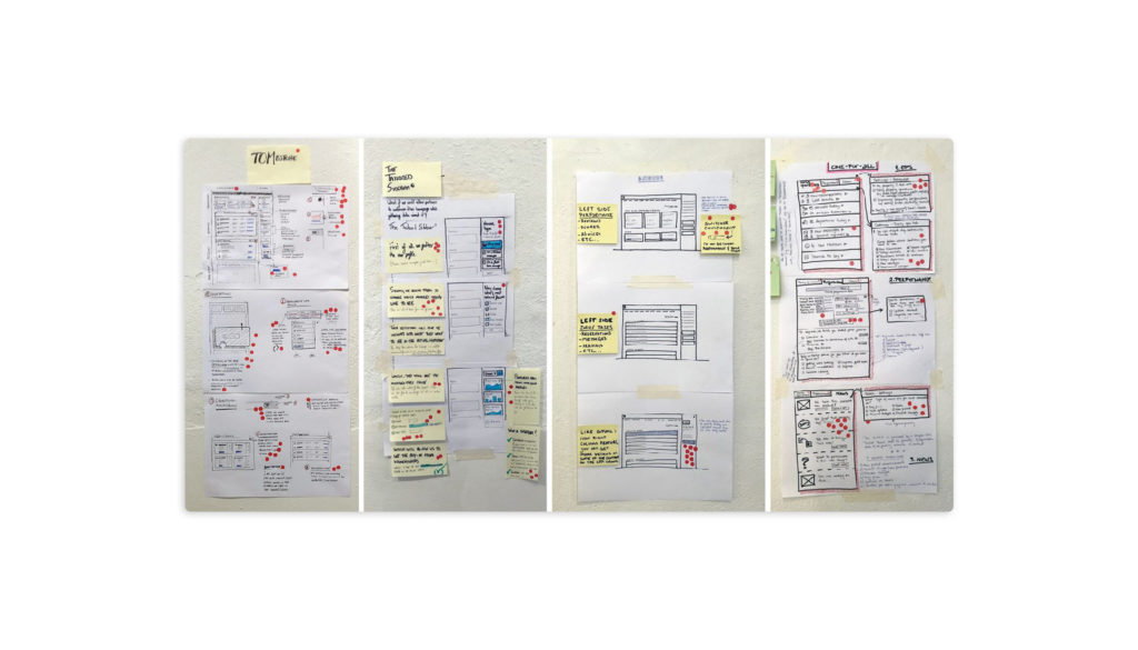
As a next step, I planned a four day design sprint with the key stakeholders, to ideate on the problem. We reflected around the idea of providing a more scalable, easy to use and easy to maintain homepage experience for our partners. We explored this by running an exercise to understand, ideate and test ideas with partners based on the following challenge:
How can we enable/empower partners to have a clear overview of their business through a homepage experience that is relevant, actionable and easy to use, while being scalable and effective for our product teams who work on it.
There were 3 takeaways from this design sprint:
- A shared definition about what is the homepage and align teams around it.
- Identify possible areas of improvements considering the different type of users beyond the accommodation type.
- Prototype ideas and test with group of partners to define next steps of our homepage.
I documented the outcome of the sprint, reviewed and aligned with stakeholders followed by defining product roadmap with my product manager. I also did a UX and technical audit (cover all the states of the homepage, desktop and mobile), defined product features, and both qualitative and quantitative testing to make sure our launch of the new beta version.
THE SOLUTION
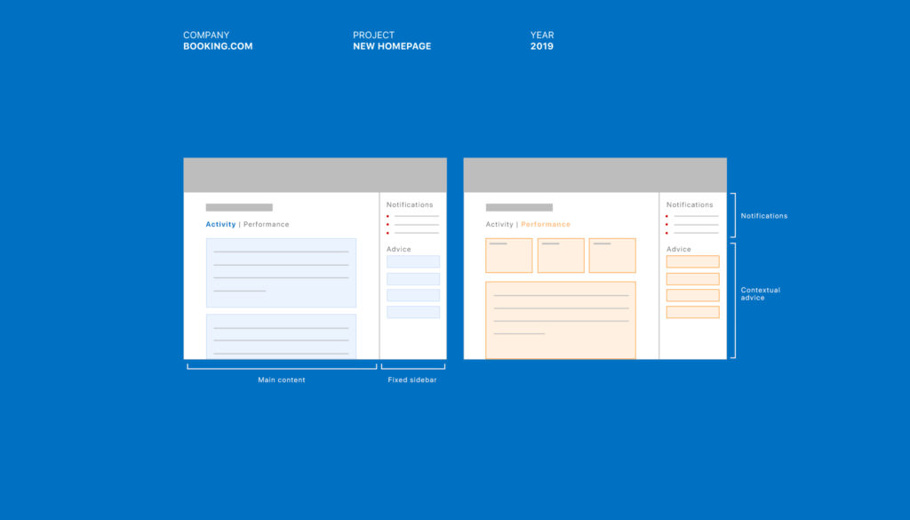
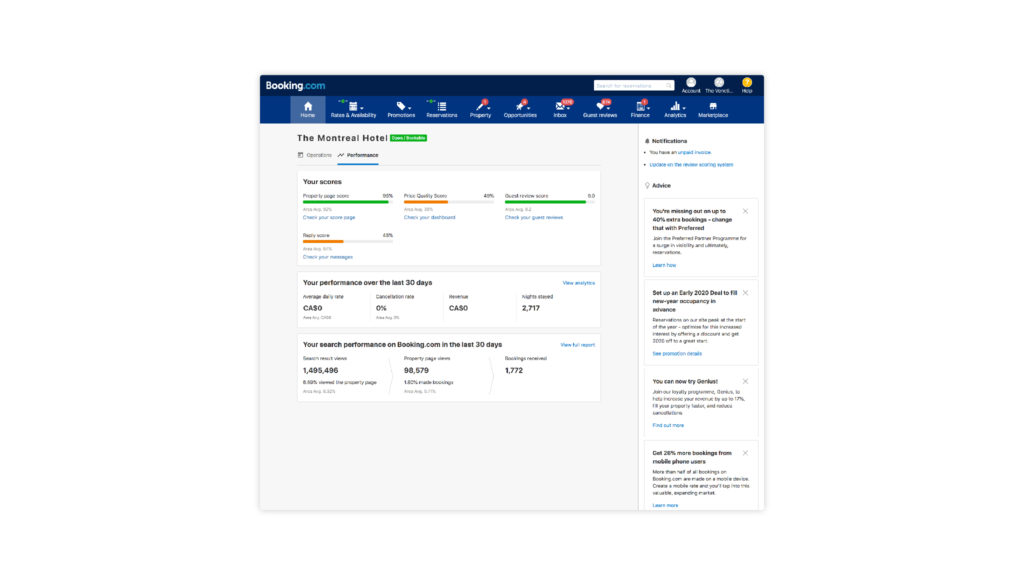
During the session, I came up with the idea of adding our content in two separate tabs for ‘Operations’ which would have their daily activities (checkins, checkouts, guest reviews and messages) and ‘Performance’ which would show key business metrics with B.com in a snapshot.

Even thought we had multiple personas and segments using our site. I wanted to avoid offering a customisable structure where they could turn on/off blocks based on their preferences. The reason was that long-term, it would have created missed opportunities for our partners and our internal teams to provide helpful insights to our partners business improvements when needed. My interest was to create a better grouping in our content to be accessible through a simple click away when needed. I also helped in creating guidelines and tips for our internal teams to follow when adding new content within the homepage.
THE IMPACT
The homepage redesign brought positive impact for all partners from all segment globally, such as home and holiday rental, big globe hotel chains like Hilton. We used quantitative way measuring the impact. The primary metric was customer service inbound. Accommodation service tickets per property per day was conclusively non-inferior. I also looked at our critical business metric, net revenue of bookings, which showed an increasing. The satisfaction feedback with the new page (collected through quantitative experiment) was positive. I expected the engagement to be higher at the beginning due to the novelty effect. But I was seeing twice as much interaction with the new homepage, measured in unique events per homepage session in Google analytics.
MY CONTRIBUTION
This was a hyper scale project with a great amount of stakeholders. As the lead designer, I successfully designed all user flows and rebuild information architecture. I did an excellent executive work including building a consistent interface, delivering all working files to developers to secure the quality. I kept updated all our related teams at B.com by sharing learnings and giving presentations. I contributed in building the homepage product guidelines for teams to maker sure we deliver to partner one useful product.